
Chapter 4 “Tidy” Data
In Subsection 1.2.1, we introduced the concept of a data frame in R: a rectangular spreadsheet-like representation of data where the rows correspond to observations and the columns correspond to variables describing each observation. In Chapter 2, we created visualizations using data stored in a data frame, and in Chapter 3, we learned how to take existing data frames and transform/modify them to suit our ends.
In this final chapter of the “Data Science with tidyverse” portion of the book, we extend some of these ideas by discussing a type of data formatting called “tidy” data. You will see that having data stored in “tidy” format is about more than just what the everyday definition of the term “tidy” might suggest: having your data “neatly organized.” Instead, we define the term “tidy” as it’s used by data scientists who use R, outlining a set of rules by which data is saved.
Knowledge of this type of data formatting was not necessary for our treatment of data visualization in Chapter 2 and data wrangling in Chapter 3. This is because all the data used were already in “tidy” format. In this chapter, we’ll now see that this format is essential to using the tools we covered up until now. Furthermore, it will also be useful for all subsequent chapters in this book when we cover statistical inference and regression.
Chapter Learning Objectives
At the end of this chapter, you should be able to…
• Determine if a dataset is in the “tidy” format necessary for using
tidyverse functions.
• Convert a data frame from a “wide” format to a “tidy” format.
Needed packages
Let’s load all the packages needed for this chapter (this assumes you’ve already installed them). If needed, read Section 1.3 for information on how to install and load R packages.
4.1 “Tidy” data
We will learn about the concept of “tidy” data with a motivating example from the fivethirtyeight package. The fivethirtyeight package (Kim, Ismay, and Chunn 2021) provides access to the datasets used in many articles published by the data journalism website, FiveThirtyEight.com. For a complete list of all 129 datasets included in the fivethirtyeight package, check out the package webpage by going to: https://fivethirtyeight-r.netlify.app/articles/fivethirtyeight.html.
Let’s focus our attention on the drinks data frame and look at its first 5 rows:
# A tibble: 5 × 5
country beer_servings spirit_servings wine_servings total_litres_of_pure…¹
<chr> <int> <int> <int> <dbl>
1 Afghanistan 0 0 0 0
2 Albania 89 132 54 4.9
3 Algeria 25 0 14 0.7
4 Andorra 245 138 312 12.4
5 Angola 217 57 45 5.9
# ℹ abbreviated name: ¹total_litres_of_pure_alcoholAfter reading the help file by running ?drinks, you’ll see that drinks is a data frame containing results from a survey of the average number of servings of beer, spirits, and wine consumed in 193 countries. This data was originally reported on FiveThirtyEight.com in Mona Chalabi’s article: “Dear Mona Followup: Where Do People Drink The Most Beer, Wine And Spirits?”.
Let’s apply some of the data wrangling verbs we learned in Chapter 3 on the drinks data frame:
filter()thedrinksdata frame to only consider 4 countries: the United States, China, Italy, and Saudi Arabia, thenselect()all columns excepttotal_litres_of_pure_alcoholby using the-sign, thenrename()the variablesbeer_servings,spirit_servings, andwine_servingstobeer,spirit, andwine, respectively.
and save the resulting data frame in drinks_smaller:
drinks_smaller <- drinks %>%
  filter(country %in% c("USA", "China", "Italy", "Saudi Arabia")) %>%
  select(-total_litres_of_pure_alcohol) %>%
  rename(beer = beer_servings, spirit = spirit_servings, wine = wine_servings)
drinks_smaller
# A tibble: 4 × 4
country beer spirit wine
<chr> <int> <int> <int>
1 China 79 192 8
2 Italy 85 42 237
3 Saudi Arabia 0 5 0
4 USA 249 158 84Let’s now ask ourselves a question: “Using the drinks_smaller data frame, how would we create the side-by-side barplot in Figure 4.1?”. Recall we saw barplots displaying two categorical variables in Subsection 2.8.2.
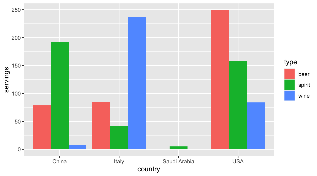
FIGURE 4.1: Comparing alcohol consumption in 4 countries.
Let’s break down the grammar of graphics we introduced in Section 2.1:
- The categorical variable
countrywith four levels (China, Italy, Saudi Arabia, USA) would have to be mapped to thex-position of the bars. - The numerical variable
servingswould have to be mapped to they-position of the bars (the height of the bars). - The categorical variable
typewith three levels (beer, spirit, wine) would have to be mapped to thefillcolor of the bars.
Observe that drinks_smaller has three separate variables beer, spirit, and wine. In order to use the ggplot() function to recreate the barplot in Figure 4.1 however, we need a single variable type with three possible values: beer, spirit, and wine. We could then map this type variable to the fill aesthetic of our plot. In other words, to recreate the barplot in Figure 4.1, our data frame would have to look like this:
# A tibble: 12 × 3
country type servings
<chr> <chr> <int>
1 China beer 79
2 Italy beer 85
3 Saudi Arabia beer 0
4 USA beer 249
5 China spirit 192
6 Italy spirit 42
7 Saudi Arabia spirit 5
8 USA spirit 158
9 China wine 8
10 Italy wine 237
11 Saudi Arabia wine 0
12 USA wine 84Observe that while drinks_smaller and drinks_smaller_tidy are both rectangular in shape and contain the same 12 numerical values (3 alcohol types by 4 countries), they are formatted differently. drinks_smaller is formatted in what’s known as “wide” format, whereas drinks_smaller_tidy is formatted in what’s known as “long/narrow” format.
In the context of doing data science in R, long/narrow format is also known as “tidy” format. In order to use the ggplot2 and dplyr packages for data visualization and data wrangling, your input data frames must be in “tidy” format. Thus, all non-“tidy” data must be converted to “tidy” format first. Before we convert non-“tidy” data frames like drinks_smaller to “tidy” data frames like drinks_smaller_tidy, let’s define “tidy” data.
4.1.1 Definition of “tidy” data
You have surely heard the word “tidy” in your life:
- “Tidy up your room!”
- “Write your homework in a tidy way so it is easier to provide feedback.”
- Marie Kondo’s best-selling book, The Life-Changing Magic of Tidying Up: The Japanese Art of Decluttering and Organizing, and Netflix TV series Tidying Up with Marie Kondo.
- “I am not by any stretch of the imagination a tidy person, and the piles of unread books on the coffee table and by my bed have a plaintive, pleading quality to me - ‘Read me, please!’” - Linda Grant
What does it mean for your data to be “tidy”? While “tidy” has a clear English meaning of “organized,” the word “tidy” in data science using R means that your data follows a standardized format. We will follow Hadley Wickham’s definition of “tidy” data (Wickham 2014) shown also in Figure 4.2:
A dataset is a collection of values, usually either numbers (if quantitative) or strings AKA text data (if qualitative/categorical). Values are organised in two ways. Every value belongs to a variable and an observation. A variable contains all values that measure the same underlying attribute (like height, temperature, duration) across units. An observation contains all values measured on the same unit (like a person, or a day, or a city) across attributes.
“Tidy” data is a standard way of mapping the meaning of a dataset to its structure. A dataset is messy or tidy depending on how rows, columns and tables are matched up with observations, variables and types. In tidy data:
- Each variable forms a column.
- Each observation forms a row.
- Each type of observational unit forms a table.
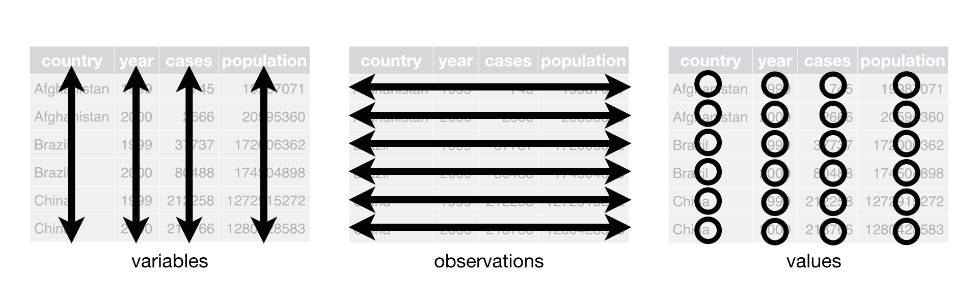
FIGURE 4.2: Tidy data graphic from R for Data Science.
For example, say you have the following table of chick weights (in g) in Table 4.1:
| Date | Chick 1 weight | Chick 2 weight | Chick 3 weight |
|---|---|---|---|
| 2009-01-01 | 173.55 g | 174.90 g | 174.34 g |
| 2009-01-02 | 172.61 g | 171.42 g | 170.04 g |
Although the data are neatly organized in a rectangular spreadsheet-type format, they do not follow the definition of data in “tidy” format. While there are three variables corresponding to three unique pieces of information (date, chick ID, and weight), there are not three columns. In “tidy” data format, each variable should be its own column, as shown in Table 4.2. Notice that both tables present the same information, but in different formats.
| Date | Chick ID | Weight |
|---|---|---|
| 2009-01-01 | 1 | 173.55 g |
| 2009-01-01 | 2 | 174.90 g |
| 2009-01-01 | 3 | 174.34 g |
| 2009-01-02 | 1 | 172.61 g |
| 2009-01-02 | 2 | 171.42 g |
| 2009-01-02 | 3 | 170.04 g |
Now we have the requisite three columns Date, Chick ID, and Weight. On the other hand, consider the data in Table 4.3.
| Date | Chick 1 weight | Weather |
|---|---|---|
| 2009-01-01 | 173.55 g | Sunny |
| 2009-01-02 | 172.61 g | Overcast |
In this case, even though the variable “Chick 1 weight” occurs just like in our non-“tidy” data in Table 4.1, the data is “tidy” since there are three variables corresponding to three unique pieces of information: Date, Chick 1 weight, and the Weather that particular day.
Learning check
(LC4.1) What are common characteristics of “tidy” data frames?
(LC4.2) What makes “tidy” data frames useful for organizing data?
4.1.2 Converting to “tidy” data
In this book so far, you’ve only seen data frames that were already in “tidy” format. Furthermore, for the rest of this book, you’ll mostly only see data frames that are already in “tidy” format as well. This is not always the case however with all datasets in the world. If your original data frame is in wide (non-“tidy”) format and you would like to use the ggplot2 or dplyr packages, you will first have to convert it to “tidy” format. To do so, we recommend using the pivot_longer() function in the tidyr package (Wickham, Vaughan, and Girlich 2023).
Going back to our drinks_smaller data frame from earlier:
# A tibble: 4 × 4
  country       beer spirit  wine
  <chr>        <int>  <int> <int>
1 China           79    192     8
2 Italy           85     42   237
3 Saudi Arabia     0      5     0
4 USA 249 158 84We convert it to “tidy” format by using the pivot_longer() function from the tidyr package as follows:
drinks_smaller_tidy <- drinks_smaller %>%
  pivot_longer(names_to = "type",
               values_to = "servings",
               cols = -country)
drinks_smaller_tidy
# A tibble: 12 × 3
country type servings
<chr> <chr> <int>
1 China beer 79
2 China spirit 192
3 China wine 8
4 Italy beer 85
5 Italy spirit 42
6 Italy wine 237
7 Saudi Arabia beer 0
8 Saudi Arabia spirit 5
9 Saudi Arabia wine 0
10 USA beer 249
11 USA spirit 158
12 USA wine 84We set the arguments to pivot_longer() as follows:
names_tohere corresponds to the name of the variable in the new “tidy”/long data frame that will contain the column names of the original data. Observe how we setnames_to = "type". In the resultingdrinks_smaller_tidy, the columntypecontains the three types of alcoholbeer,spirit, andwine. Sincetypeis a variable name that doesn’t appear indrinks_smaller, we use quotation marks around it. You’ll receive an error if you just usenames_to = typehere.values_tohere is the name of the variable in the new “tidy” data frame that will contain the values of the original data. Observe how we setvalues_to = "servings"since each of the numeric values in each of thebeer,wine, andspiritcolumns of thedrinks_smallerdata corresponds to a value ofservings. In the resultingdrinks_smaller_tidy, the columnservingscontains the 4 \(\times\) 3 = 12 numerical values. Note again thatservingsdoesn’t appear as a variable indrinks_smallerso it again needs quotation marks around it for thevalues_toargument.- The third argument
colsis the columns in thedrinks_smallerdata frame you either want to or don’t want to “tidy.” Observe how we set this to-countryindicating that we don’t want to “tidy” thecountryvariable indrinks_smallerand rather onlybeer,spirit, andwine. Sincecountryis a column that appears indrinks_smallerwe don’t put quotation marks around it.
The third argument here of cols is a little nuanced, so let’s consider code that’s written slightly differently but that produces the same output:
drinks_smaller %>%
  pivot_longer(names_to = "type",
               values_to = "servings",
               cols = c(beer, spirit, wine))
Note that the third argument now specifies which columns we want to “tidy” with c(beer, spirit, wine), instead of the columns we don’t want to “tidy” using -country. We use the c() function to create a vector of the columns in drinks_smaller that we’d like to “tidy.” Note that since these three columns appear one after another in the drinks_smaller data frame, we could also do the following for the cols argument:
With our drinks_smaller_tidy “tidy” formatted data frame, we can now produce the barplot you saw in Figure 4.1 using geom_col(). This is done in Figure 4.3. Recall from Section 2.8 on barplots that we use geom_col() and not geom_bar(), since we would like to map the “pre-counted” servings variable to the y-aesthetic of the bars.
ggplot(drinks_smaller_tidy, aes(x = country, y = servings, fill = type)) +
  geom_col(position = "dodge")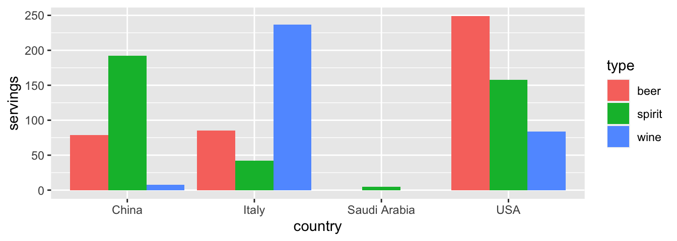
FIGURE 4.3: Comparing alcohol consumption in 4 countries using geom_col().
Converting “wide” format data to “tidy” format often confuses new R users. The only way to learn to get comfortable with the pivot_longer() function is with practice, practice, and more practice using different datasets. For example, run ?pivot_longer and look at the examples in the bottom of the help file. We’ll show another example of using pivot_longer() to convert a “wide” formatted data frame to “tidy” format in Section 4.2.
If however you want to convert a “tidy” data frame to “wide” format, you will need to use the pivot_wider() function instead. Run ?pivot_wider and look at the examples in the bottom of the help file for examples.
You can also view examples of both pivot_longer() and pivot_wider() on the tidyverse.org webpage. There’s a nice example to check out the different functions available for data tidying and a case study using data from the World Health Organization on that webpage. Furthermore, each week the R4DS Online Learning Community posts a dataset in the weekly #TidyTuesday event that might serve as a nice place for you to find other data to explore and transform.
Learning check
(LC4.3) Take a look again at the blackbird data frame that you previously imported in Subsection 1.5.1. Run the following:
blackbird <- read_csv("https://whitlockschluter3e.zoology.ubc.ca/Data/chapter12/chap12e2BlackbirdTestosterone.csv")
blackbird
As mentioned earlier, blackbird is a data frame containing information that compares the immunocompetence of red-winged blackbirds before and after testosterone implants. For simplicity, let’s remove the last two columns, which are the log-transformed values of the data in the previous two columns:
# A tibble: 13 × 3
   blackbird beforeImplant afterImplant
       <dbl>         <dbl>        <dbl>
 1         1           105           85
 2         2            50           74
 3         3           136          145
 4         4            90           86
 5         5           122          148
 6         6           132          148
 7         7           131          150
 8         8           119          142
 9         9           145          151
10        10           130          113
11        11           116          118
12        12           110           99
13        13           138          150
This data frame is not in “tidy” format. How would you convert this data frame to be in “tidy” format, so that it has a variable Time_Period indicating the time period (before or after implant) and a variable Measurement of the immunocompetence level?
4.2 Case study: Weight loss data
In this section, we’ll show you another example of how to convert a data frame that isn’t in “tidy” format (“wide” format) to a data frame that is in “tidy” format (“long/narrow” format). We’ll do this using the pivot_longer() function from the tidyr package again.
Then, we’ll make use of functions from the ggplot2 and dplyr packages to produce a time-series plot showing weight loss data for three groups of individuals: control, diet, and diet plus exercise. Recall that we saw time-series plots in Section 2.4 on creating linegraphs using geom_line().
We’ll summarize the WeightLoss data frame available in the carData package and focus on average weight loss data for the Diet + Exercise group.
WeeklyAverage <- WeightLoss %>%
  group_by(group) %>%
  summarise(mean_wl1 = mean(wl1),
            mean_wl2 = mean(wl2),
            mean_wl3 = mean(wl3))
WeeklyAverage
# A tibble: 3 × 4
group mean_wl1 mean_wl2 mean_wl3
<fct> <dbl> <dbl> <dbl>
1 Control 4.5 3.33 2.08
2 Diet 5.33 3.92 2.25
3 DietEx 6.2 6.1 2.2 Now, let’s lay out the grammar of graphics we saw in Section 2.1.
First we know we need to set data = WeeklyAverage and use a geom_line() layer, but what is the aesthetic mapping of variables? We’d like to see how the weight loss has changed over the months for each group, so we need to map:
monthto the x-position aesthetic,weightlossto the y-position aesthetic, andgroupto the color aesthetic.
Now we are stuck in a predicament, much like with our drinks_smaller example in Section 4.1. We have a variable/column named group, but the other variables/columns have combined information about both the month and the average weight loss. Because the WeeklyAverage data frame is not “tidy”, we cannot use the ggplot2 package until the data is in the appropriate format to apply the grammar of graphics.
So how do we convert this data frame into a tidy format. First, we need to take the numeric values from the mean_wl column names in WeeklyAverage and place them into a new “names” variable called month. Then, we need to take the average weight loss values inside the data frame and turn them into a new “values” variable called weightloss. Our resulting data frame will have three columns: group, month, and weightloss. Recall that the pivot_longer() function in the tidyr package does this for us:
WeeklyAverage_tidy <- WeeklyAverage %>%
  pivot_longer(cols = -group,
               names_to = "month",
               values_to = "weightloss")
WeeklyAverage_tidy
# A tibble: 9 × 3
group month weightloss
<fct> <chr> <dbl>
1 Control mean_wl1 4.5
2 Control mean_wl2 3.33
3 Control mean_wl3 2.08
4 Diet mean_wl1 5.33
5 Diet mean_wl2 3.92
6 Diet mean_wl3 2.25
7 DietEx mean_wl1 6.2
8 DietEx mean_wl2 6.1
9 DietEx mean_wl3 2.2 - The first argument specifies the columns you either want to or don’t want to “tidy.” We set this to
cols = -groupindicating that we don’t want to “tidy” thegroupvariable but do want to “tidy” the other variables inWeeklyAverage. names_tois the name of the variable in the new “tidy” data frame that will contain the column names of the original data. Observe how we setnames_to = "month". In the resultingWeeklyAverage_tidy, the columnmonthindicates the month (1, 2, or 3) that the weight loss was measured.values_tois the name of the variable in the new “tidy” data frame that will contain the values of the original data. Observe how we setvalues_to = "weightloss". In the resultingWeeklyAverage_tidydata frame, the columnweightlosscontains the 3 \(\times\) 3 = 9 weight loss scores as numeric values.
This is a good start, but to create the time-series plot, the month variable needs to be numeric, not a character string. We can fix this by converting the month variable to an integer using two additional arguments in the pivot_longer command. We’ll use names_prefix to strip off the mean_wl prefix from each column name, and names_transform to convert month into an integer variable.
WeeklyAverage_tidy <- WeeklyAverage %>%
  pivot_longer(cols = -group,
               names_to = "month",
               names_prefix = "mean_wl",
               names_transform = list(month = as.integer),
               values_to = "weightloss")
WeeklyAverage_tidy
# A tibble: 9 × 3
group month weightloss
<fct> <int> <dbl>
1 Control 1 4.5
2 Control 2 3.33
3 Control 3 2.08
4 Diet 1 5.33
5 Diet 2 3.92
6 Diet 3 2.25
7 DietEx 1 6.2
8 DietEx 2 6.1
9 DietEx 3 2.2 We can now create the time-series plot in Figure 4.4 using geom_line() to visualize how weight loss scores in each group changed during the study. Furthermore, we’ll use the labs() function in the ggplot2 package to add informative labels to the aes()thetic attributes of our plot.
ggplot(WeeklyAverage_tidy, aes(x = month, y = weightloss, color = group)) +
  geom_line() +
  labs(x = "Month", y = "Weight Loss Score", color = "Study group")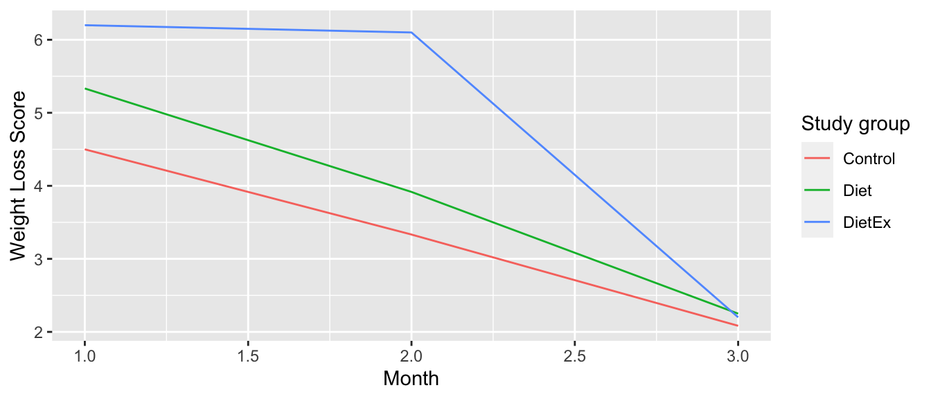
FIGURE 4.4: Weight loss scores of control group.
We see that the Diet + Exercise (DietEx) group had a higher average weight loss score in the first month than the other groups, but eventually the average weight loss scores converged in the third month.
Note that if we forgot to include the names_transform argument specifying that month should be in the integer format, we would have gotten an error here since geom_line() wouldn’t have known how to sort the character values in month in the right order.
Learning check
(LC4.4) Prepare line graphs displaying the average weight loss scores with time for each group using facets instead. Is the faceted plot more helpful for comparing the groups than the original plot?
(LC4.5) Read in the life expectancy data stored at https://moderndive.com/data/le_mess.csv and convert it to a “tidy” data frame.
4.3 tidyverse package
Notice at the beginning of the chapter we loaded the following four packages, which are among four of the most frequently used R packages for data science:
Recall that ggplot2 is for data visualization, dplyr is for data wrangling, readr is for importing spreadsheet data into R, and tidyr is for converting data to “tidy” format. There is a much quicker way to load these packages than by individually loading them: by installing and loading the tidyverse package. The tidyverse package acts as an “umbrella” package whereby installing/loading it will install/load multiple packages at once for you.
After installing the tidyverse package as you would a normal package as seen in Section 1.3, running:
would be the same as running:
library(ggplot2)
library(dplyr)
library(readr)
library(tidyr)
library(purrr)
library(tibble)
library(stringr)
library(forcats)The purrr, tibble, stringr, and forcats are left for a more advanced book; check out R for Data Science to learn about these packages.
For the remainder of this book, we’ll start every chapter by running library(tidyverse), instead of loading the various component packages individually. The tidyverse “umbrella” package gets its name from the fact that all the functions in all its packages are designed to have common inputs and outputs: data frames are in “tidy” format. This standardization of input and output data frames makes transitions between different functions in the different packages as seamless as possible. For more information, check out the tidyverse.org webpage for the package.
4.4 Conclusion
4.4.1 Additional resources
If you want to learn more about using the readr and tidyr package, we suggest that you check out RStudio’s cheat sheets. In the current version of RStudio, you can access these by going to the RStudio Menu Bar -> Help -> Cheat Sheets -> “Browse Cheatsheets…”. on Cheatsheets web page, scroll down the page to find the cheatsheets for readr and tidyr.
4.4.2 What’s to come?
Congratulations! You’ve completed the “Data Science with tidyverse” portion of this book. We’ll now move to the “Statistical Inference with infer” portion of this book. Statistical inference is the science of inferring about some unknown quantity using sampling.
The most well-known examples of sampling in practice involve polls. Because asking an entire population about their opinions would be a long and arduous task, pollsters often take a smaller sample that is hopefully representative of the population. Based on the results of this sample, pollsters hope to make claims about the entire population.
As shown in Figure 4.5, once we’ve covered Chapter 5 on sampling, we’ll examine confidence intervals in Chapter 6 and hypothesis testing in Chapter 7.
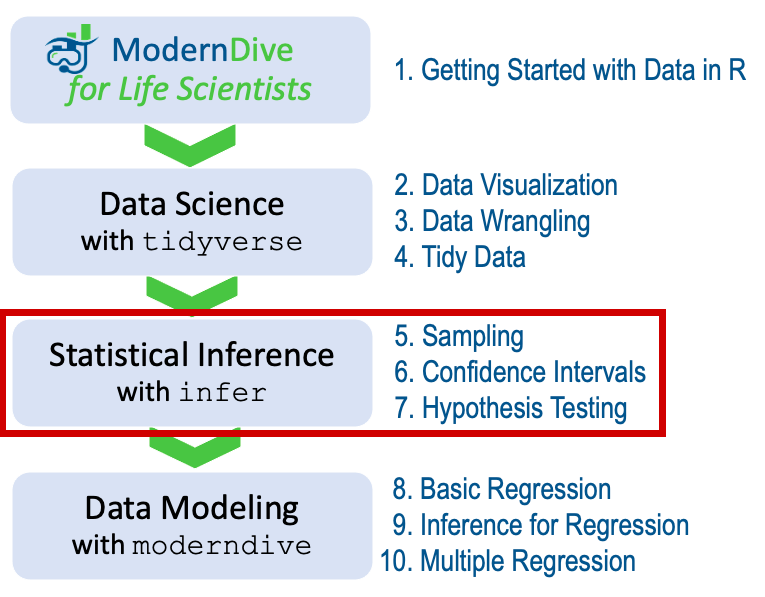
FIGURE 4.5: ModernDive for Life Scientists flowchart - on to Part II!