
Chapter 10 Multiple Regression
In Chapter 8 we introduced ideas related to modeling for explanation, in particular that the goal of modeling is to make explicit the relationship between some outcome variable \(y\) and some explanatory variable \(x\). While there are many approaches to modeling, we focused on one particular technique: linear regression, one of the most commonly used and easy-to-understand approaches to modeling. Furthermore to keep things simple, we only considered models with one explanatory \(x\) variable that was either numerical in Section 8.1 or categorical in Section 8.2.
In this chapter on multiple regression, we’ll start considering models that include more than one explanatory variable \(x\). You can imagine when trying to model a particular outcome variable, like proportion of the lion nose that is black as in Section 8.1 or life expectancy as in Section 8.2, that it would be useful to include more than just one explanatory variable’s worth of information.
Since our regression models will now consider more than one explanatory variable, the interpretation of the associated effect of any one explanatory variable must be made in conjunction with the other explanatory variables included in your model. Let’s begin!
Chapter Learning Objectives
At the end of this chapter, you should be able to…
* Fully interpret a multiple linear regression table for multiple
regression.
* Use available evidence to determine if an interaction or parallel
slopes model is more appropriate.
* Use a mathematical formula for multiple linear regression to compute
the fitted value for given explanatory values.
Needed packages
Let’s load all the packages needed for this chapter (this assumes you’ve already installed them). Recall from our discussion in Section 4.3 that loading the tidyverse package by running library(tidyverse) loads the following commonly used data science packages all at once:
ggplot2for data visualizationdplyrfor data wranglingtidyrfor converting data to “tidy” formatreadrfor importing spreadsheet data into R- As well as the more advanced
purrr,tibble,stringr, andforcatspackages
If needed, read Section 1.3 for information on how to install and load R packages.
10.1 One numerical and one categorical explanatory variable
Previously we looked at the relationship between age and nose coloration (proportion black) of male lions in Section 8.1. The variable proportion.black was the numerical outcome variable \(y\), and the variable age was the numerical explanatory \(x\) variable.
In this section, we are going to consider a different model. Rather than a single explanatory variable, we’ll now include two different explanatory variables. In this example, we’ll look at the relationship between tooth growth and vitamin C intake in guinea pigs. Could it be that increasing levels of vitamin C stimulate tooth growth? Or could it instead be that increasing levels reduce tooth growth? Are there differences in tooth growth depending on the method used to deliver vitamin C?
We’ll answer these questions by modeling the relationship between these variables using multiple regression, where we have:
- A numerical outcome variable \(y\),
len, the length of odontoblasts, the cells responsible for tooth growth, and - Two explanatory variables:
- A numerical explanatory variable \(x_1\),
dose, the dose of vitamin C, in milligrams/day. - A categorical explanatory variable \(x_2\),
supp, the delivery method, either as orange juice (OJ) or ascorbic acid (VC).
- A numerical explanatory variable \(x_1\),
10.1.1 Exploratory data analysis
Our dataset is called ToothGrowth and included in R’s datasets package. Recall the three common steps in an exploratory data analysis we saw in Subsection 8.1.1:
- Looking at the raw data values.
- Computing summary statistics.
- Creating data visualizations.
Let’s first look at the raw data values by either looking at ToothGrowth using RStudio’s spreadsheet viewer or by using the glimpse() function from the dplyr package:
Rows: 60
Columns: 3
$ len  <dbl> 4.2, 11.5, 7.3, 5.8, 6.4, 10.0, 11.2, 11.2, 5.2, 7.0, 16.5, 16.5,…
$ supp <fct> VC, VC, VC, VC, VC, VC, VC, VC, VC, VC, VC, VC, VC, VC, VC, VC, V…
$ dose <dbl> 0.5, 0.5, 0.5, 0.5, 0.5, 0.5, 0.5, 0.5, 0.5, 0.5, 1.0, 1.0, 1.0, …
Let’s also display a random sample of 5 rows of the 60 rows corresponding to different courses in Table 10.1. Remember due to the random nature of the sampling, you will likely end up with a different subset of 5 rows.
| len | supp | dose |
|---|---|---|
| 8.2 | OJ | 0.5 |
| 4.2 | VC | 0.5 |
| 20.0 | OJ | 1.0 |
| 21.5 | VC | 2.0 |
| 27.3 | OJ | 1.0 |
Now that we’ve looked at the raw values in our ToothGrowth data frame and got a sense of the data, let’s compute summary statistics. As we did in our exploratory data analyses in Sections 8.1.1 and 8.2.1, let’s use the skim() function from the skimr package:
| Name | Piped data |
| Number of rows | 60 |
| Number of columns | 3 |
| _______________________ | |
| Column type frequency: | |
| factor | 1 |
| numeric | 2 |
| ________________________ | |
| Group variables | None |
Variable type: factor
| skim_variable | n_missing | complete_rate | ordered | n_unique | top_counts |
|---|---|---|---|---|---|
| supp | 0 | 1 | FALSE | 2 | OJ: 30, VC: 30 |
Variable type: numeric
| skim_variable | n_missing | complete_rate | mean | sd | p0 | p25 | p50 | p75 | p100 | hist |
|---|---|---|---|---|---|---|---|---|---|---|
| len | 0 | 1 | 18.81 | 7.65 | 4.2 | 13.1 | 19.2 | 25.3 | 33.9 | ▅▃▅▇▂ |
| dose | 0 | 1 | 1.17 | 0.63 | 0.5 | 0.5 | 1.0 | 2.0 | 2.0 | ▇▇▁▁▇ |
Observe that we have no missing data, that there are 30 guinea pigs given orange juice and 30 guinea pigs given ascorbic acid, and that the average vitamin C dose is 1.17.
Furthermore, let’s compute the correlation coefficient between our two numerical variables: len and dose. Recall from Subsection 8.1.1 that correlation coefficients only exist between numerical variables. We observe that they are “clearly positively” correlated.
    cor
1 0.803
Let’s now perform the last of the three common steps in an exploratory data analysis: creating data visualizations. Given that the outcome variable len and explanatory variable dose are both numerical, we’ll use a scatterplot to display their relationship. How can we incorporate the categorical variable supp, however? By mapping the variable supp to the color aesthetic, thereby creating a colored scatterplot. The following code is similar to the code that created the scatterplot of proportion black nose over lion age in Figure 8.3, but with color = supp added to the aes()thetic mapping.
ggplot(ToothGrowth, aes(x = dose, y = len, color = supp)) +
  geom_point() +
  labs(x = "Dose", y = "Tooth length", color = "Supplement") +
  geom_smooth(method = "lm", se = FALSE)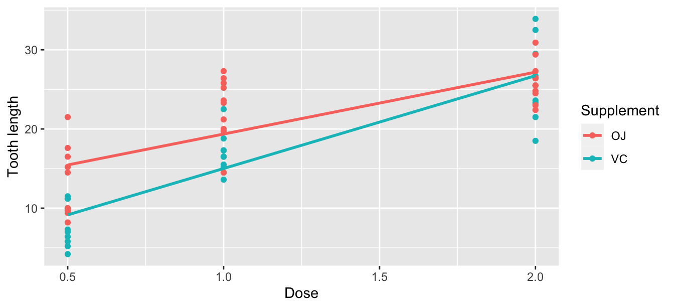
FIGURE 10.1: Colored scatterplot of relationship of tooth length and dose.
In the resulting Figure 10.1, observe that ggplot() assigns a default in red/blue color scheme to the points and to the lines associated with the two levels of supp: OJ and VC. Furthermore, the geom_smooth(method = "lm", se = FALSE) layer automatically fits a different regression line for each group.
We notice an interesting trend. While both regression lines are positively sloped with dose levels (i.e., guinea pigs receiving higher doses of vitamin C tend to have longer teeth), the slope for dose for the VC guinea pigs is more positive.
10.1.2 Interaction model
Let’s now quantify the relationship of our outcome variable \(y\) and the two explanatory variables using one type of multiple regression model known as an interaction model. We’ll explain where the term “interaction” comes from at the end of this section.
In particular, we’ll write out the equation of the two regression lines in Figure 10.1 using the values from a regression table. Before we do this, however, let’s go over a brief refresher of regression when you have a categorical explanatory variable \(x\).
Recall in Subsection 8.2.2 we fit a regression model for countries’ life expectancies as a function of which continent the country was in. In other words, we had a numerical outcome variable \(y\) = lifeExp and a categorical explanatory variable \(x\) = continent which had 5 levels: Africa, Americas, Asia, Europe, and Oceania. Let’s re-display the regression table you saw in Table 8.8:
| term | estimate | std_error | statistic | p_value | lower_ci | upper_ci |
|---|---|---|---|---|---|---|
| intercept | 54.8 | 1.02 | 53.45 | 0 | 52.8 | 56.8 |
| continent: Americas | 18.8 | 1.80 | 10.45 | 0 | 15.2 | 22.4 |
| continent: Asia | 15.9 | 1.65 | 9.68 | 0 | 12.7 | 19.2 |
| continent: Europe | 22.8 | 1.70 | 13.47 | 0 | 19.5 | 26.2 |
| continent: Oceania | 25.9 | 5.33 | 4.86 | 0 | 15.4 | 36.5 |
Recall our interpretation of the estimate column. Since Africa was the “baseline for comparison” group, the intercept term corresponds to the mean life expectancy for all countries in Africa of 54.8 years. The other four values of estimate correspond to “offsets” relative to the baseline group. So, for example, the “offset” corresponding to the Americas is +18.8 as compared to the baseline for comparison group Africa. In other words, the average life expectancy for countries in the Americas is 18.8 years higher. Thus the mean life expectancy for all countries in the Americas is 54.8 + 18.8 = 73.6. The same interpretation holds for Asia, Europe, and Oceania.
Going back to our multiple regression model for tooth length using dose and supplement in Figure 10.1, we generate the regression table using the same two-step approach from Chapter 8: we first “fit” the model using the lm() “linear model” function and then we apply the get_regression_table() function. This time, however, our model formula won’t be of the form y ~ x, but rather of the form y ~ x1 * x2. In other words, our two explanatory variables x1 and x2 are separated by a * sign:
# Fit regression model:
len_model_interaction <- lm(len ~ dose * supp, data = ToothGrowth)

# Get regression table:
get_regression_table(len_model_interaction)| term | estimate | std_error | statistic | p_value | lower_ci | upper_ci |
|---|---|---|---|---|---|---|
| intercept | 11.55 | 1.58 | 7.30 | 0.000 | 8.382 | 14.72 |
| dose | 7.81 | 1.20 | 6.53 | 0.000 | 5.417 | 10.21 |
| supp: VC | -8.26 | 2.24 | -3.69 | 0.001 | -12.735 | -3.77 |
| dose:suppVC | 3.90 | 1.69 | 2.31 | 0.025 | 0.518 | 7.29 |
Looking at the regression table output in Table 10.4, there are four rows of values in the estimate column. While it is not immediately apparent, using these four values we can write out the equations of both lines in Figure 10.1. First, since the word OJ comes alphabetically before VC, the orange juice supplement is the “baseline for comparison” group. Thus, intercept is the intercept for only the orange juice recipients.
This holds similarly for dose. It is the slope for dose for only the OJ recipients. Thus, the red regression line in Figure 10.1 has an intercept of 11.55 and slope for dose of 7.81.
What about the intercept and slope for dose of the ascorbic acid recipients in the blue line in Figure 10.1? This is where our notion of “offsets” comes into play once again.
The value for suppVC of -8.26 is not the intercept for the ascorbic acid recipients, but rather the offset in intercept for these guinea pigs relative to orange juice recipients. The intercept for the ascorbic acid recipients is intercept + suppVC = 11.55 + (-8.26) = 3.29.
Similarly, dose:suppVC = 3.904 is not the slope for dose for the ascorbic acid recipients, but rather the offset in slope for those guinea pigs. Therefore, the slope for dose for the ascorbic acid recipients is dose + dose:suppVC \(= 7.81 + 3.904 = 11.714\). Thus, the blue regression line in Figure 10.1 has intercept 3.29 and slope for dose of 11.714. Let’s summarize these values in Table 10.5 and focus on the two slopes for dose:
| Supplement | Intercept | Slope for dose |
|---|---|---|
| Orange juice | 11.55 | 7.81 |
| Ascorbic acid | 3.29 | 11.71 |
Since the slope for dose for the orange recipients was 7.81, it means that on average, a guinea pig who receives one unit more would have a tooth length that is 7.81 units higher. For the ascorbic acid recipients, however, the corresponding associated increase was on average 11.714 units. While both slopes for dose were positive, the slope for dose for the VC recipients is more positive. This is consistent with our observation from Figure 10.1, that this model is suggesting that dose impacts tooth length for ascorbic acid (VC) recipients more than for orange juice recipients.
Let’s now write the equation for our regression lines, which we can use to compute our fitted values \(\widehat{y} = \widehat{\text{len}}\).
\[ \begin{aligned} \widehat{y} = \widehat{\text{len}} &= b_0 + b_{\text{dose}} \cdot \text{dose} + b_{\text{VC}} \cdot \mathbb{1}_{\text{is VC}}(x) + b_{\text{dose,VC}} \cdot \text{dose} \cdot \mathbb{1}_{\text{is VC}}(x)\\ &= 11.55 + 7.81 \cdot \text{dose} - 8.26 \cdot \mathbb{1}_{\text{is VC}}(x) + 3.904 \cdot \text{dose} \cdot \mathbb{1}_{\text{is VC}}(x) \end{aligned} \]
Whoa! That’s even more daunting than the equation you saw for the life expectancy as a function of continent in Subsection 8.2.2! However, if you recall what an “indicator function” does, the equation simplifies greatly. In the previous equation, we have one indicator function of interest:
\[ \mathbb{1}_{\text{is VC}}(x) = \left\{ \begin{array}{ll} 1 & \text{if } \text{supp } x \text{ is VC} \\ 0 & \text{otherwise}\end{array} \right. \]
Second, let’s match coefficients in the previous equation with values in the estimate column in our regression table in Table 10.4:
- \(b_0\) is the
intercept= 11.55 for the orange juice recipients - \(b_{\text{dose}}\) is the slope for
dose= 7.81 for the orange juice recipients - \(b_{\text{VC}}\) is the offset in intercept = -8.26 for the ascorbic acid (VC) recipients
- \(b_{\text{dose,VC}}\) is the offset in slope for dose = 3.904 for the ascorbic acid (VC) recipients
Let’s put this all together and compute the fitted value \(\widehat{y} = \widehat{\text{len}}\) for orange juice recipients. Since for orange juice recipients \(\mathbb{1}_{\text{is VC}}(x)\) = 0, the previous equation becomes
\[ \begin{aligned} \widehat{y} = \widehat{\text{len}} &= 11.55 + 7.81 \cdot \text{dose} - 8.26 \cdot 0 + 3.904 \cdot \text{dose} \cdot 0\\ &= 11.55 + 7.81 \cdot \text{dose} - 0 + 0\\ &= 11.55 + 7.81 \cdot \text{dose}\\ \end{aligned} \]
which is the equation of the red regression line in Figure 10.1 corresponding to the orange juice recipients in Table 10.5. Correspondingly, since for ascorbic acid (VC) recipients \(\mathbb{1}_{\text{is VC}}(x)\) = 1, the previous equation becomes
\[ \begin{aligned} \widehat{y} = \widehat{\text{len}} &= 11.55 + 7.81 \cdot \text{dose} - 8.26 + 3.904 \cdot \text{dose}\\ &= (11.55 - 8.26) + (r slope_OJ` + 3.904) * \text{dose}\\ &= 3.29 + 11.714 \cdot \text{dose}\\ \end{aligned} \]
which is the equation of the blue regression line in Figure 10.1 corresponding to the ascorbic acid (VC) recipients in Table 10.5.
Phew! That was a lot of arithmetic! Don’t fret, however, this is as hard as modeling will get in this book. If you’re still a little unsure about using indicator functions and using categorical explanatory variables in a regression model, we highly suggest you re-read Subsection 8.2.2. This involves only a single categorical explanatory variable and thus is much simpler.
Before we end this section, we explain why we refer to this type of model as an “interaction model.” The \(b_{\text{dose,VC}}\) term in the equation for the fitted value \(\widehat{y}\) = \(\widehat{\text{len}}\) is what’s known in statistical modeling as an “interaction effect.” The interaction term corresponds to the dose:suppVC = 3.904 in the final row of the regression table in Table 10.4.
We say there is an interaction effect if the associated effect of one variable depends on the value of another variable. That is to say, the two variables are “interacting” with each other. Here, the associated effect of the variable dose depends on the value of the other variable supp. The difference in slopes for dose of +3.904 of ascorbic acid (VC) recipients relative to orange juice recipients shows this.
Another way of thinking about interaction effects on tooth length is as follows. For a given pig, there might be an associated effect of their dose by itself, there might be an associated effect of their supplement by itself, but when dose and supplement are considered together there might be an additional effect above and beyond the two individual effects.
10.1.3 Parallel slopes model
When creating regression models with one numerical and one categorical explanatory variable, we are not just limited to interaction models as we just saw. Another type of model we can use is known as a parallel slopes model. Unlike interaction models where the regression lines can have different intercepts and different slopes, parallel slopes models still allow for different intercepts but force all lines to have the same slope. The resulting regression lines are thus parallel. Let’s visualize the best-fitting parallel slopes model to ToothGrowth.
Unfortunately, the geom_smooth() function in the ggplot2 package does not have a convenient way to plot parallel slopes models. Evgeni Chasnovski thus created a special purpose function called geom_parallel_slopes() that is included in the moderndive package. You won’t find geom_parallel_slopes() in the ggplot2 package, so to use it, you will need to load both the ggplot2 and moderndive packages. Using this function, let’s now plot the parallel slopes model for tooth length. Notice how the code is identical to the code that produced the visualization of the interaction model in Figure 10.1, but now the geom_smooth(method = "lm", se = FALSE) layer is replaced with geom_parallel_slopes(se = FALSE).
ggplot(ToothGrowth, aes(x = dose, y = len, color = supp)) +
  geom_point() +
  labs(x = "Dose", y = "Tooth length", color = "Supplement type") +
  geom_parallel_slopes(se = FALSE)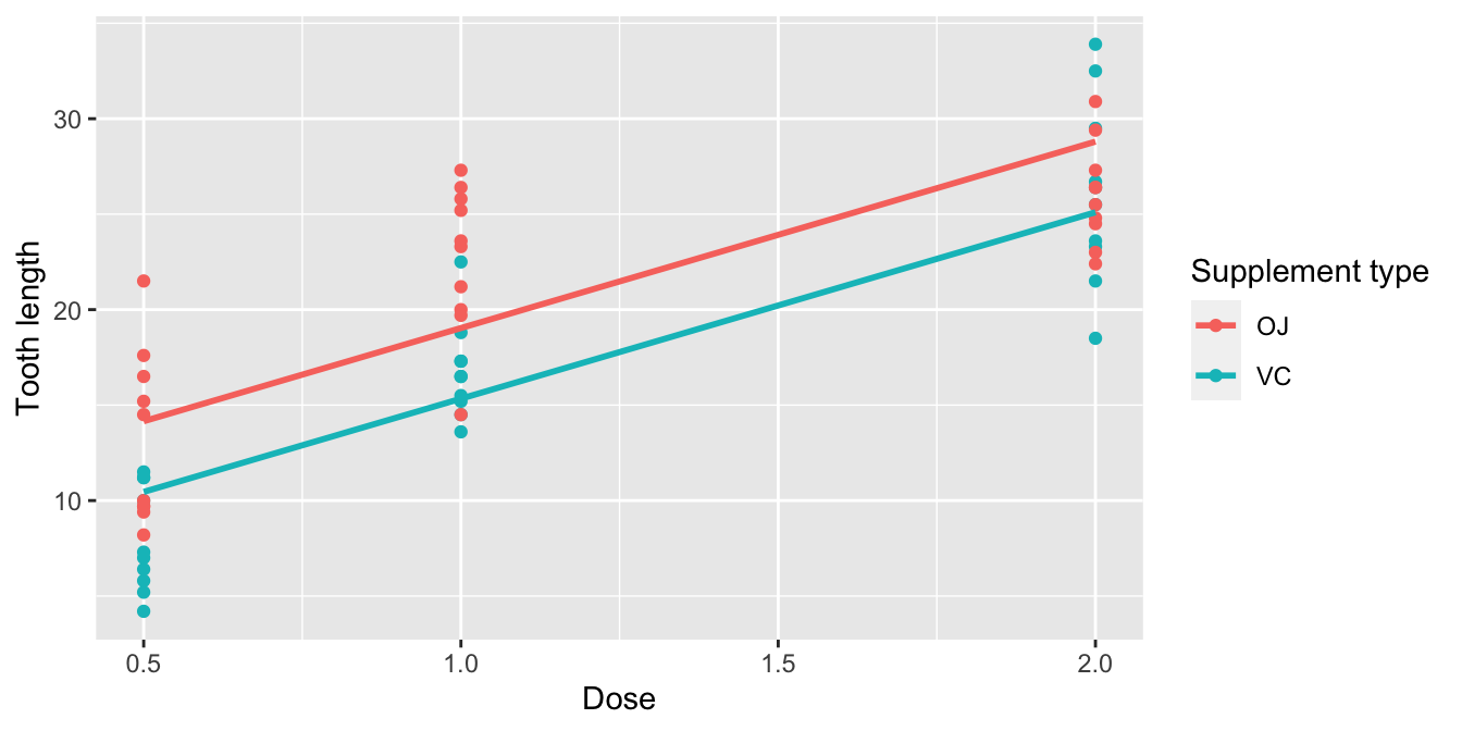
FIGURE 10.2: Parallel slopes model of len with dose and supp.
Observe in Figure 10.2 that we now have parallel lines corresponding to the orange juice and ascorbic acid (VC) recipients, respectively: here they have the same positive slope. This is telling us that guinea pigs who receive higher doses of vitamin C will tend to have longer teeth than guinea pigs who receive less. Furthermore, since the lines are parallel, the associated gain for higher dose is assumed to be the same for both orange juice and ascorbic acid (VC) recipients.
Also observe in Figure 10.2 that these two lines have different intercepts as evidenced by the fact that the blue line corresponding to the ascorbic acid (VC) recipients is lower than the red line corresponding to the orange juice recipients. This is telling us that irrespective of dose, orange juice recipients tended to have longer teeth than ascorbic acid (VC) recipients.
In order to obtain the precise numerical values of the two intercepts and the single common slope, we once again “fit” the model using the lm() “linear model” function and then apply the get_regression_table() function. However, unlike the interaction model which had a model formula of the form y ~ x1 * x2, our model formula is now of the form y ~ x1 + x2. In other words, our two explanatory variables x1 and x2 are separated by a + sign:
# Fit regression model:
len_model_parallel_slopes <- lm(len ~ dose + supp, data = ToothGrowth)
# Get regression table:
get_regression_table(len_model_parallel_slopes)| term | estimate | std_error | statistic | p_value | lower_ci | upper_ci |
|---|---|---|---|---|---|---|
| intercept | 9.27 | 1.282 | 7.23 | 0.000 | 6.71 | 11.84 |
| dose | 9.76 | 0.877 | 11.13 | 0.000 | 8.01 | 11.52 |
| supp: VC | -3.70 | 1.094 | -3.38 | 0.001 | -5.89 | -1.51 |
Similar to the regression table for the interaction model from Table 10.4, we have an intercept term corresponding to the intercept for the “baseline for comparison” orange juice (OJ) group and a suppVC term corresponding to the offset in intercept for the ascorbic acid (VC) recipients relative to orange juice recipients. In other words, in Figure 10.2 the red regression line corresponding to the orange juice recipients has an intercept of 9.27 while the blue regression line corresponding to the ascorbic acid (VC) recipients has an intercept of 9.27 + -3.7 = 5.57.
Unlike in Table 10.4, however, we now only have a single slope for dose of 9.764. This is because the model dictates that both the orange juice and ascorbic acid (VC) recipients have a common slope for dose. This is telling us that a guinea pig who received a vitamin C dose one unit higher has tooth length that is on average 9.764 units longer. This benefit for receiving a higher vitamin C dose applies equally to both orange juice and ascorbic acid (VC) recipients.
Let’s summarize these values in Table 10.7, noting the different intercepts but common slopes:
| Supplement | Intercept | Slope for dose |
|---|---|---|
| Orange juice (OJ) | 9.27 | 9.764 |
| Ascorbic acid (VC) | 5.57 | 9.764 |
Let’s now write the equation for our regression lines, which we can use to compute our fitted values \(\widehat{y} = \widehat{\text{len}}\).
\[ \begin{aligned} \widehat{y} = \widehat{\text{len}} &= b_0 + b_{\text{dose}} \cdot \text{dose} + b_{\text{VC}} \cdot \mathbb{1}_{\text{is VC}}(x)\\ &= 9.27 + 9.764 \cdot \text{dose} + -3.7 \cdot \mathbb{1}_{\text{is VC}}(x) \end{aligned} \]
Let’s put this all together and compute the fitted value \(\widehat{y} = \widehat{\text{len}}\) for orange juice recipients. Since for orange juice recipients the indicator function \(\mathbb{1}_{\text{is VC}}(x)\) = 0, the previous equation becomes
\[ \begin{aligned} \widehat{y} = \widehat{\text{len}} &= 9.27 + 9.764 \cdot \text{dose} + -3.7 \cdot 0\\ &= 9.27 + 9.764 \cdot \text{dose} \end{aligned} \]
which is the equation of the red regression line in Figure 10.2 corresponding to the orange juice recipients. Correspondingly, since for ascorbic acid (VC) recipients the indicator function \(\mathbb{1}_{\text{is VC}}(x)\) = 1, the previous equation becomes
\[ \begin{aligned} \widehat{y} = \widehat{\text{len}} &= 9.27 + 9.764 \cdot \text{dose} + -3.7 \cdot 1\\ &= (9.27 + -3.7) + 9.764 \cdot \text{dose}\\ &= 5.57+ 9.764 \cdot \text{dose} \end{aligned} \]
which is the equation of the blue regression line in Figure 10.2 corresponding to the ascorbic acid (VC) recipients.
Great! We’ve considered both an interaction model and a parallel slopes model for our data. Let’s compare the visualizations for both models side-by-side in Figure 10.3.
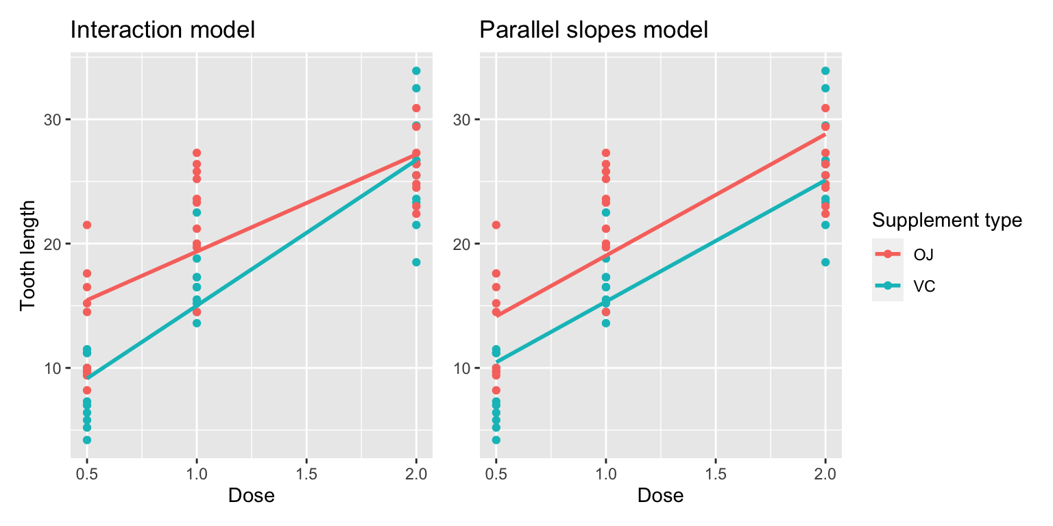
FIGURE 10.3: Comparison of interaction and parallel slopes models.
At this point, you might be asking yourself: “Why would we ever use a parallel slopes model?”. Looking at the left-hand plot in Figure 10.3, the two lines definitely do not appear to be parallel, so why would we force them to be parallel? For this data, we agree! It can easily be argued that the interaction model on the left is more appropriate. However, in the upcoming Subsection 10.3.1 on model selection, we’ll present an example where it can be argued that the case for a parallel slopes model might be stronger.
10.1.4 Observed/fitted values and residuals
For brevity’s sake, in this section we’ll only compute the observed values, fitted values, and residuals for the interaction model which we saved in len_model_interaction. You’ll have an opportunity to study the corresponding values for the parallel slopes model in the upcoming Learning check.
Say, you have a guinea pig who receives orange juice of 2 mg/day. What fitted value \(\widehat{y}\) = \(\widehat{\text{len}}\) would our model yield? Say, you have another guinea pig who receives ascorbic acid of 1 mg/day. What would their fitted value \(\widehat{y}\) be?
We answer this question visually first for the orange juice recipient by finding the intersection of the red regression line and the vertical line at \(x\) = dose = 2. We mark this value with a large red dot in Figure 10.4. Similarly, we can identify the fitted value \(\widehat{y}\) = \(\widehat{\text{len}}\) for the ascorbic acid recipient by finding the intersection of the blue regression line and the vertical line at \(x\) = dose = 1. We mark this value with a large blue dot in Figure 10.4.
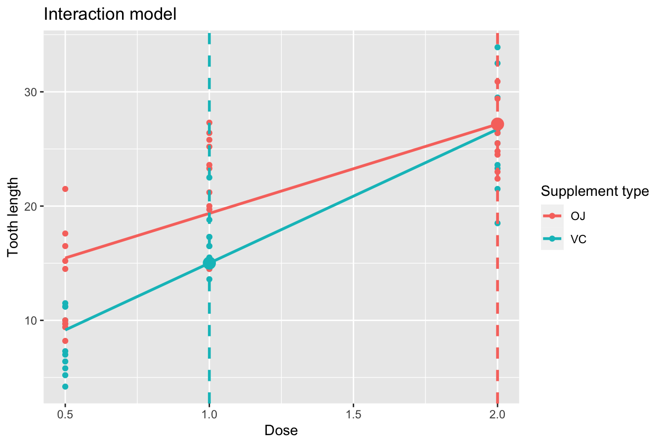
FIGURE 10.4: Fitted values for two supplement doses.
What are these two values of \(\widehat{y}\) = \(\widehat{\text{len}}\) precisely? We can use the equations of the two regression lines we computed in Subsection 10.1.2, which in turn were based on values from the regression table in Table 10.4:
- For all orange juice recipients: \(\widehat{y} = \widehat{\text{len}} = 11.55 + 7.81 \cdot \text{dose}\)
- For all ascorbic acid (VC) recipients: \(\widehat{y} = \widehat{\text{len}} = 3.29 + 11.714 \cdot \text{dose}\)
So our fitted values would be: \(11.55 - -7.81 \cdot 2 = 27.17\) and \(3.29 + 11.714 \cdot 1 = 15.00\), respectively.
Now what if we want the fitted values not just for these two guinea pigs, but for all 60 guinea pigs included in the ToothGrowth data frame? Doing this by hand would be long and tedious! This is where the get_regression_points() function from the moderndive package can help: it will quickly automate the above calculations for all 60 guinea pigs. We present a preview of the first 5 rows for each supplement type out of 60 in Table 10.8.
regression_points <- get_regression_points(len_model_interaction)
regression_points %>% group_by(supp) %>% slice_head(n=5)| ID | len | dose | supp | len_hat | residual |
|---|---|---|---|---|---|
| 31 | 15.2 | 0.5 | OJ | 15.46 | -0.256 |
| 32 | 21.5 | 0.5 | OJ | 15.46 | 6.044 |
| 33 | 17.6 | 0.5 | OJ | 15.46 | 2.144 |
| 34 | 9.7 | 0.5 | OJ | 15.46 | -5.756 |
| 35 | 14.5 | 0.5 | OJ | 15.46 | -0.956 |
| 1 | 4.2 | 0.5 | VC | 9.15 | -4.953 |
| 2 | 11.5 | 0.5 | VC | 9.15 | 2.347 |
| 3 | 7.3 | 0.5 | VC | 9.15 | -1.853 |
| 4 | 5.8 | 0.5 | VC | 9.15 | -3.353 |
| 5 | 6.4 | 0.5 | VC | 9.15 | -2.753 |
It turns out that the first five orange juice recipients received 0.5 mg/day of vitamin C. The resulting \(\widehat{y}\) = \(\widehat{\text{len}}\) fitted values are in the len_hat column. Furthermore, the get_regression_points() function also returns the residuals \(y-\widehat{y}\). Notice, for example, the second and third guinea pigs receiving orange juice had positive residuals, indicating that the actual tooth growth values were greater than their fitted length of 15.46. On the other hand, the first and fourth guinea pigs had negative residuals, indicating that the actual tooth growth values were less than 15.46.
Learning check
(LC9.1) Compute the observed values, fitted values, and residuals not for the interaction model as we just did, but rather for the parallel slopes model we saved in len_model_parallel_slopes.
10.2 Two categorical explanatory variables
Let’s now switch gears and consider multiple regression models where instead of one numerical and one categorical explanatory variable, we now have two categorical explanatory variables. The dataset we’ll use is from Analysis of Biological Data by Whitlock and Schluter. Its accompanying abd R package contains the IntertidalAlgae dataset that we’ll use next.
This dataset is from a study looking at the effect of herbivores and height above low tide, and the interaction between these factors, on abundance of a red intertidal alga.
In this section, we’ll fit a regression model where we have
- A numerical outcome variable \(y\), sqrt.area, the square root of the area (in cm2) covered by red algae at the experiment’s end, and
- Two explanatory variables:
- A categorical explanatory variable \(x_1\), herbivores, referring to the absence or presence of herbivores.
- Another categorical explanatory variable \(x_2\), height, referring to the height of the experimental plot relative to the tide levels.
10.2.1 Exploratory data analysis
Let’s examine the Intertidal dataset using RStudio’s spreadsheet viewer or glimpse().
Rows: 64
Columns: 3
$ height     <fct> low, low, low, low, low, low, low, low, low, low, low, low,…
$ herbivores <fct> minus, minus, minus, minus, minus, minus, minus, minus, min…
$ sqrt.area  <dbl> 9.406, 34.468, 46.673, 16.642, 24.377, 38.351, 33.777, 61.0…
Furthermore, let’s look at a random sample of five out of the 64 plots in Table 10.9. Once again, note that due to the random nature of the sampling, you will likely end up with a different subset of five rows.
| height | herbivores | sqrt.area |
|---|---|---|
| low | minus | 46.17 |
| low | minus | 41.79 |
| mid | minus | 45.54 |
| low | plus | 27.64 |
| mid | minus | 3.15 |
Now that we’ve looked at the raw values in our IntertidalAlgae data frame and got a sense of the data, let’s move on to the next common step in an exploratory data analysis: computing summary statistics. Let’s use the skim() function from the skimr package:
| Name | Piped data |
| Number of rows | 64 |
| Number of columns | 3 |
| _______________________ | |
| Column type frequency: | |
| factor | 2 |
| numeric | 1 |
| ________________________ | |
| Group variables | None |
Variable type: factor
| skim_variable | n_missing | complete_rate | ordered | n_unique | top_counts |
|---|---|---|---|---|---|
| height | 0 | 1 | FALSE | 2 | low: 32, mid: 32 |
| herbivores | 0 | 1 | FALSE | 2 | min: 32, plu: 32 |
Variable type: numeric
| skim_variable | n_missing | complete_rate | mean | sd | p0 | p25 | p50 | p75 | p100 | hist |
|---|---|---|---|---|---|---|---|---|---|---|
| sqrt.area | 0 | 1 | 22.8 | 17.1 | 0.71 | 5.92 | 22.2 | 37.2 | 61.1 | ▇▃▅▆▁ |
Observe the summary statistics for the outcome variable sqrt.area: the mean and median sqrt.area are 22.84 and 22.25, respectively, and that 25% of plots had values of 5.92 or less.
Now let’s look at the explanatory variables herbivores and height. First, let’s visualize the relationship of the outcome variable with each of the two explanatory variables in separate box plots with an overlaid scatterplot to see the individual data points in Figure 10.5.
ggplot(IntertidalAlgae, aes(x = herbivores, y = sqrt.area)) +
  geom_boxplot() +
  geom_jitter(width = 0.1) +
  labs(x = "Herbivore treatment", y = "Square root of area covered",
       title = "Area coverage and herbivore treatment")

ggplot(IntertidalAlgae, aes(x = height, y = sqrt.area)) +
  geom_boxplot() +
  geom_jitter(width = 0.1) +
  labs(x = "Height relative to low tide",
       y = "Square root of area covered",
title = "Area coverage and tidal location") 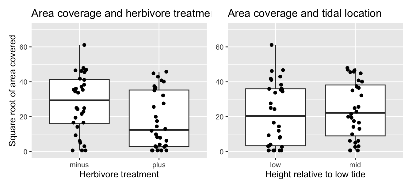
FIGURE 10.5: Relationship between red algae coverage and herbivores/height.
It seems that the herbivore treatment, but not tidal location, has some effect on its own on red algae coverage. With respect to herbivore treatment, the median of \(y\) is almost half in the presence of herbivores (plus) as compared to the absence (minus). With respect to height above low tide, the median of \(y\) is nearly the same in the low tide group as in the mid tide group.
However, the two plots in Figure 10.5 only focus on the relationship of the outcome variable with each of the two explanatory variables separately. To visualize the joint relationship of all three variables simultaneously, let’s make just a scatterplot and indicate the other explanatory variable by color. Each of the 64 observations in the IntertidalAlgae data frame are marked with a point where
- The numerical outcome variable \(y\)
sqrt.areais on the vertical axis. - The first categorical explanatory variable \(x_1\)
herbivoresis on the horizontal axis. - The second categorical explanatory variable \(x_2\)
heightis indicated by color.
ggplot(IntertidalAlgae, aes(x = herbivores, y = sqrt.area,
                            color = height, group = height)) +
  geom_jitter(width = 0.1) +
  labs(x = "Herbivore treatment", y = "Square root of area covered",
       title = "Area coverage and herbivore treatment") +
  geom_smooth(method = "lm", se = FALSE)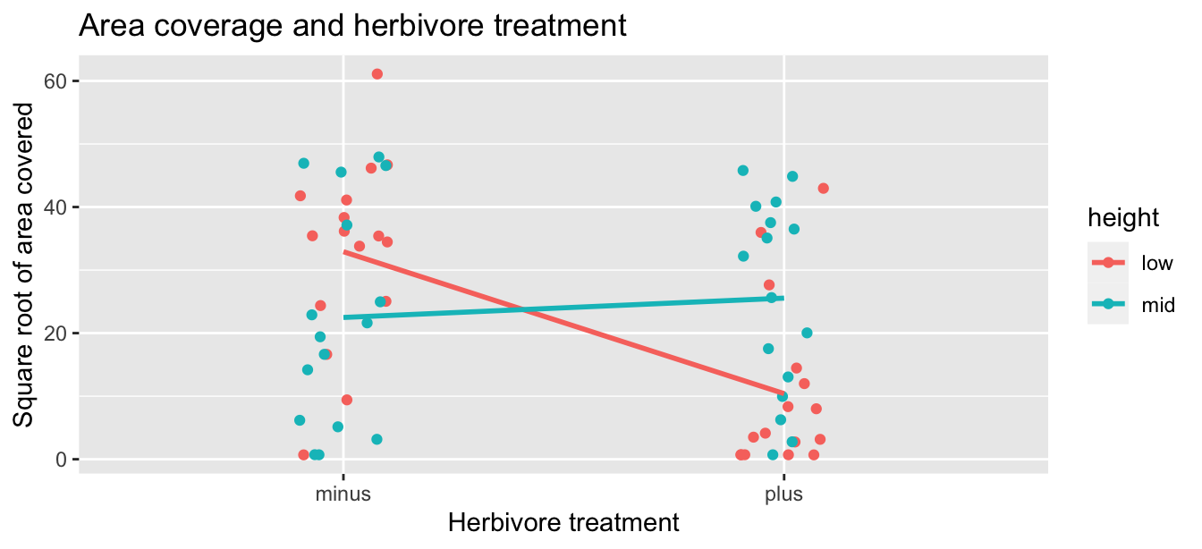
FIGURE 10.6: Relationship between red algae coverage and herbivores plus height.
Furthermore, we also include the regression lines for each height level (low or mid). Recall from Subsection 8.3.2 that regression lines are “best-fitting” in that of all possible lines we can draw through a cloud of points, the regression line minimizes the sum of squared residuals. This concept also extends to models with two categorical explanatory variables.
Learning check
(LC9.2) Prepare a new plot with the same outcome variable \(y\) sqrt.area but with the second explanatory variable \(x_2\) height on the horizontal axis and the first explanatory variable \(x_1\) on the color layers. How does this plot compare with the previous one?
10.2.2 Regression lines
Let’s now fit a regression model and get the regression table corresponding to the regression line in Figure 10.6. As we have done throughout Chapter 8 and this chapter, we use our two-step process to obtain the regression table for this model in Table 10.11.
# Fit regression model:
area_model1 <- lm(sqrt.area ~ herbivores * height, data = IntertidalAlgae)
# Get regression table:
get_regression_table(area_model1)| term | estimate | std_error | statistic | p_value | lower_ci | upper_ci |
|---|---|---|---|---|---|---|
| intercept | 32.9 | 3.86 | 8.54 | 0.000 | 25.2 | 40.627 |
| herbivores: plus | -22.5 | 5.45 | -4.13 | 0.000 | -33.4 | -11.604 |
| height: mid | -10.4 | 5.45 | -1.91 | 0.061 | -21.3 | 0.476 |
| herbivores: plus:heightmid | 25.6 | 7.71 | 3.32 | 0.002 | 10.2 | 41.003 |
- We first “fit” the linear regression model using the
lm(y ~ x1 * x2, data)function and save it inarea_model1. - We get the regression table by applying the
get_regression_table()function from themoderndivepackage toarea_model1.
Let’s interpret the values in the estimate column. First, the intercept value is 32.9, and this will be our base value in comparison to other groups. This intercept represents the mean sqrt.area for a plot who has herbivores absent and height of low tide, and this corresponds to where the red line (low) intersects \(x\) = minus.
Second, the herbivoresplus value is -22.5. Taking into account all the other explanatory variables in our model, the addition of herbivoreshas an associated decrease on average of 22.5 in sqrt.area. We preface our interpretation with the statement, “taking into account all the other explanatory variables in our model.” Here, by all other explanatory variables we mean height and the interaction between height and herbivores. We do this to emphasize that we are now jointly interpreting the associated effect of multiple explanatory variables in the same model at the same time.
Third, heightmid is -10.4 Taking into account all other explanatory variables in our model, plots with a height of mid tide, have an associated sqrt.area decrease of, on average, 10.4 cm. And finally, herbivoresplus:heightmid is 25.6. Taking into account all other explanatory variables in our model, the addition of herbivores and a height of mid tide, have an associated sqrt.area increase of, on average, 25.6 cm.
Putting these results together, the equation of the regression lines for the interaction model to give us fitted values \(\widehat{y}\) = \(\widehat{\text{sqrt.area}}\) is:
\[ \begin{aligned} \widehat{y} &= b_0 + b_1 \cdot x_1 + b_2 \cdot x_2 + b_{\text{1,2}} \cdot x_1 \cdot x_2\\ \widehat{\text{sqrt.area}} &= b_0 + b_{\text{herbivores}} \cdot \mathbb{1}_{\text{is plus}}(x) + b_{\text{height}} \cdot \mathbb{1}_{\text{is mid}}(x) \\ &\text{ } + b_{\text{herbivores,height}} \cdot \mathbb{1}_{\text{is plus}}(x) \cdot \mathbb{1}_{\text{is mid}}(x)\\ &= 32.9 - 22.5 \cdot\mathbb{1}_{\text{is plus}}(x) - 10.4 \cdot\mathbb{1}_{\text{is mid}}(x) \\ &\text{ } + 25.6 \cdot \mathbb{1}_{\text{is plus}}(x) \cdot \mathbb{1}_{\text{is mid}}(x) \end{aligned} \]
Yes, the equation is again quite daunting, but as we saw above, once you recall what an “indicator function” does, the equation simplifies greatly. In this equation, we now have two indicator functions of interest:
\[ \mathbb{1}_{\text{is plus}}(x) = \left\{ \begin{array}{ll} 1 & \text{if } \text{herbivores } x \text{ is plus} \\ 0 & \text{otherwise}\end{array} \right. \mathbb{1}_{\text{is mid}}(x) = \left\{ \begin{array}{ll} 1 & \text{if } \text{height } x \text{ is mid} \\ 0 & \text{otherwise}\end{array} \right. \]
Okay, let’s put this all together again and compute the fitted value \(\widehat{y} = \widehat{\text{sqrt.area}}\) for red algae minus herbivores and at low level. In this case \(\mathbb{1}_{\text{is plus}}(x)\) = 0 and \(\mathbb{1}_{\text{is mid}}(x)\) = 0, the previous equation becomes
\[
\begin{aligned}
\widehat{\text{sqrt.area}} &= 32.9 - 22.5 \cdot 0 - 10.4 \cdot0 + 25.6 \cdot 0 \cdot 0 \\
&= 32.9 + 0 + 0 + 0\\
&= 32.9
\end{aligned}
\]
which is the left end of the red regression line in Figure 10.1 corresponding to the intercept in Table 10.5.
Correspondingly, for red algae plus herbivores and at low level, since \(\mathbb{1}_{\text{is plus}}(x)\) = 1 and \(\mathbb{1}_{\text{is mid}}(x)\) = 0, the previous equation becomes
\[ \begin{aligned} \widehat{\text{sqrt.area}} &= 32.9 - 22.5 \cdot 1 - 10.4 \cdot0 + 25.6 \cdot 1 \cdot 0 \\ &= 32.9 - 22.5 + 0 +0 \\ &= 10.4 \end{aligned} \]
which is the right end of the red regression line in Figure 10.1.
Moving on, for red algae minus herbivores and at mid level, since \(\mathbb{1}_{\text{is plus}}(x)\) = 0 and \(\mathbb{1}_{\text{is mid}}(x)\) = 1, the equation becomes
\[ \begin{aligned} \widehat{\text{sqrt.area}} &= 32.9 - 22.5 \cdot 0 - 10.4 \cdot 1 + 25.6 \cdot 0 \cdot 1 \\ &= 32.9 + 0 - 10.4 + 0\\ &= 22.5 \end{aligned} \]
which is the left end of the blue regression line in Figure 10.1.
And finally, for red algae plus herbivores and at mid level, since \(\mathbb{1}_{\text{is plus}}(x)\) = 1 and \(\mathbb{1}_{\text{is mid}}(x)\) = 1, the equation becomes
\[ \begin{aligned} \widehat{\text{sqrt.area}} &= 32.9 - 22.5 \cdot 1 - 10.4 \cdot 1 + 25.6 \cdot 1 \cdot 1 \\ &= 32.9 - 22.5 - 10.4 + 25.6\\ &= 25.6 \end{aligned} \]
which is the right end of the blue regression line in Figure 10.1.
That was a lot of arithmetic, but you made it! If you’re still a little unsure about using indicator functions and categorical explanatory variables in a regression model, you should re-read Subsection 8.2.2.
Recall however in the right-hand plot of Figure 10.5 that when plotting the relationship between sqrt.area and height in isolation, there appeared to be a positive relationship. In the last discussed multiple regression, however, when jointly modeling the relationship between sqrt.area, herbivores, and height, there appears to be a negative relationship of sqrt.area and height as evidenced by the negative offset for height of -10.4. What explains these contradictory results? A phenomenon known as Simpson’s Paradox, whereby overall trends that exist in aggregate either disappear or reverse when the data are broken down into groups.
Learning check
(LC9.3) Fit a new simple linear regression for a non-interaction model using lm(sqrt.area ~ herbivores + height, data = IntertidalAlgae). Get information about the “best-fitting” regression lines from the regression table by applying the get_regression_table() function. How do the regression results compare to those for the interaction model above?
10.2.3 Observed/fitted values and residuals
Let’s compute all fitted values and residuals for our interaction model using the get_regression_points() function and present only the first two rows of output for each combination of explanatory variables in Table 10.12. Remember that the coordinates of each of the blue points in Figure 10.6 can be found in the height, herbivores, and sqrt.area columns. The fitted values on the regression lines are found in the sqrt.area_hat column and are computed using our equation in the previous section:
\[ \begin{aligned} \widehat{y} = \widehat{\text{sqrt.area}} &= 32.9 - 22.5 \cdot\mathbb{1}_{\text{is plus}}(x) - 10.4 \cdot\mathbb{1}_{\text{is mid}}(x) \\ &\text{ } + 25.6 \cdot \mathbb{1}_{\text{is plus}}(x) \cdot \mathbb{1}_{\text{is mid}}(x) \end{aligned} \]
| ID | sqrt.area | herbivores | height | sqrt.area_hat | residual |
|---|---|---|---|---|---|
| 1 | 9.406 | minus | low | 32.9 | -23.51 |
| 2 | 34.468 | minus | low | 32.9 | 1.55 |
| 33 | 0.707 | minus | mid | 22.5 | -21.78 |
| 34 | 24.951 | minus | mid | 22.5 | 2.47 |
| 17 | 11.977 | plus | low | 10.4 | 1.57 |
| 18 | 14.471 | plus | low | 10.4 | 4.07 |
| 49 | 0.707 | plus | mid | 25.6 | -24.84 |
| 50 | 32.206 | plus | mid | 25.6 | 6.66 |
10.2.4 Which model, without or with interaction, fits the data better?
Above, in Subsection 10.2.2, we fit an interaction linear model to the IntertidalAlgae data and in LC9.3, you fit a non-interaction linear model. To see which linear model better fits the data, let’s compare the mean of the observed \(y\) values (Obs) of each of the four groups with their fitted \(\widehat{y}\) values for the interaction (Int) and non-interaction (Non) models. Recall that for a linear model, the observed \(y\) values for a given value of \(x\) are expected to have a normal distribution centered at the mean or fitted \(\widehat{y}\) value.
area_model2 <- lm(sqrt.area ~ herbivores + height, data = IntertidalAlgae)
means_Obs <- IntertidalAlgae %>% group_by(herbivores, height) %>% summarise(mean_Obs=mean(sqrt.area))
means_Int <- get_regression_points(area_model1) %>%
  group_by(herbivores, height) %>%
  summarise(mean_hat_Int = mean(sqrt.area_hat))
means_Non <- get_regression_points(area_model2) %>%
  group_by(herbivores, height) %>%
  summarise(mean_hat_Non = mean(sqrt.area_hat))
means_table <- means_Obs %>% inner_join(means_Int) %>% inner_join(means_Non)
means_table| herbivores | height | mean_Obs | mean_hat_Int | mean_hat_Non |
|---|---|---|---|---|
| minus | low | 32.9 | 32.9 | 26.5 |
| minus | mid | 22.5 | 22.5 | 28.9 |
| plus | low | 10.4 | 10.4 | 16.8 |
| plus | mid | 25.6 | 25.6 | 19.2 |
It’s clear from this table that the predicted (fitted) means for the interaction model (mean_hat_Int) are much closer to the observed mean (mean_Obs) than for the non-interaction model (mean_hat_Non). This is even more apparent when we overlay our scatterplot with the observed and predicted (fitted) means for each model, along with colored crossbars to mark the observed mean values (mean_Obs) for each of the four groups:
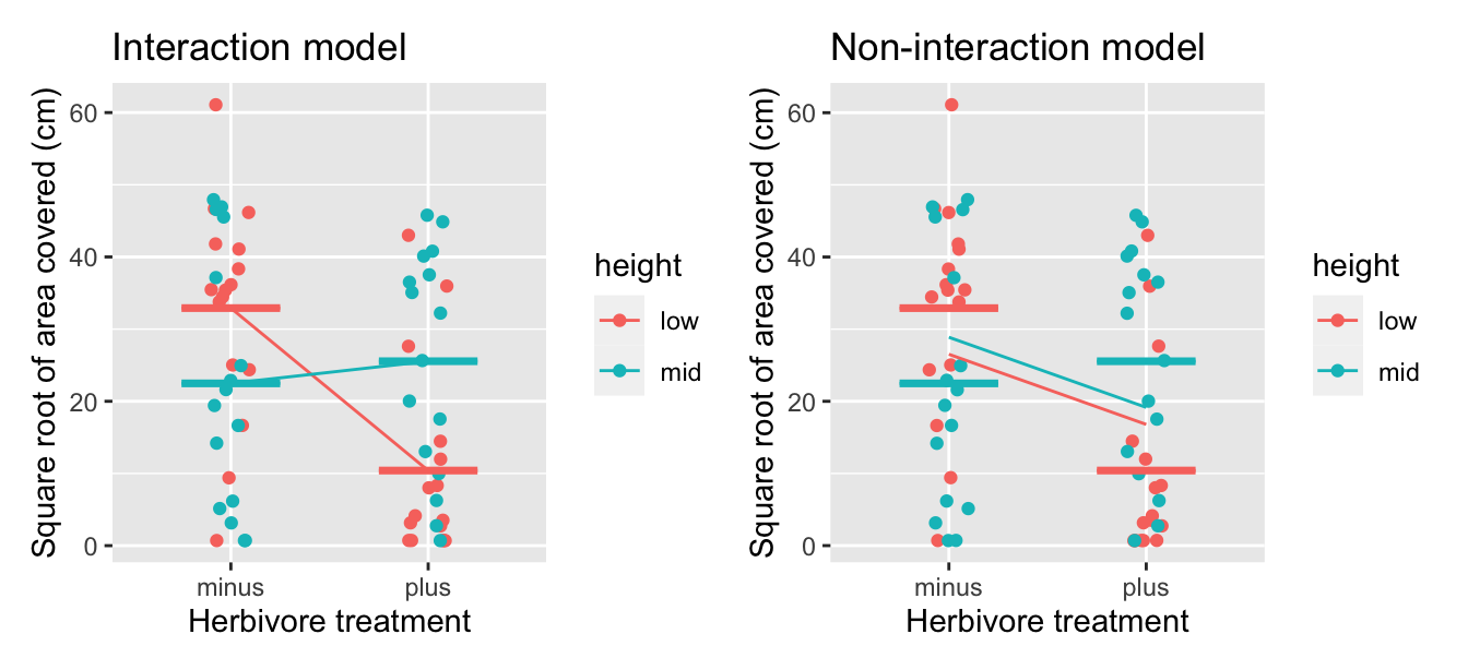
FIGURE 10.7: Comparison of interaction and parallel slopes model for red algae coverage.
In both cases examined in this chapter (ToothGrowth and IntertidalAlgae), the interaction model fit the data much better than the non-interaction (parallel slopes) model. You may be wondering if that is always the case, and if so, why do we bother fitting a non-interaction model if its fit is consistently inferior. In the next section, we’ll see that there may be circumstances when it may be more appropriate to use the non-interaction model instead of the interaction model.
10.3 Related topics
10.3.1 Model selection using visualizations
When would we ever use a parallel slopes (non-interaction) model versus an interaction model? The answer lies in a philosophical principle known as “Occam’s Razor.” It states that, “all other things being equal, simpler solutions are more likely to be correct than complex ones.” When viewed in a modeling framework, Occam’s Razor can be restated as, “all other things being equal, simpler models are to be preferred over complex ones.” In other words, we should only favor the more complex model if the additional complexity is warranted.
Let’s apply this principle to our earlier analysis. Recall that in Sections 10.1.2 and 10.1.3 we fit both interaction and parallel slopes models for the outcome variable \(y\) (tooth length) using a numerical explanatory variable \(x_1\) (dose) and a categorical explanatory variable \(x_2\) (supplement type). We compared these models in Figure 10.3, which we display again now.
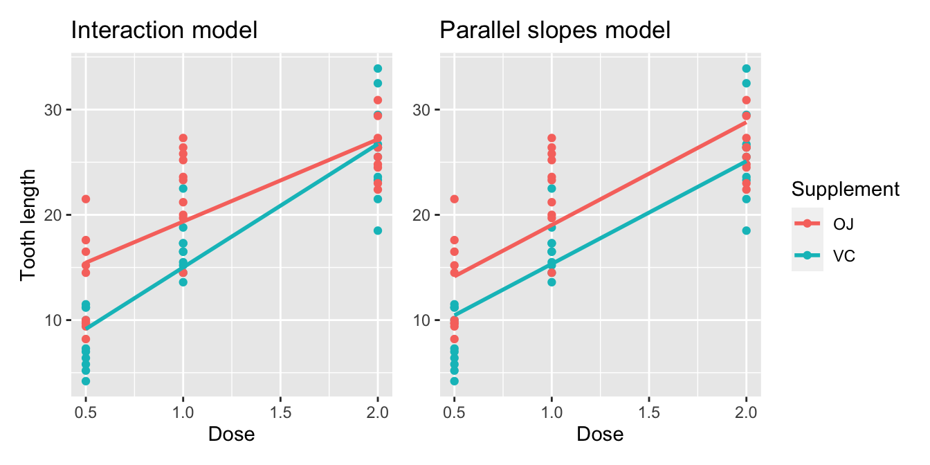
FIGURE 10.8: Previously seen comparison of interaction and parallel slopes models.
You may have asked yourselves at this point, “Why would I force the lines to have parallel slopes (as seen in the right-hand plot) when they clearly have different slopes (as seen in the left-hand plot)?”. With regards to “Occam’s Razor”, recall that the equation for the regression line of the interaction model is “more complex” in that there is an additional \(b_{\text{dose,VC}} \cdot \text{dose} \cdot \mathbb{1}_{\text{is VC}}\) interaction term not present in the equation for the parallel slopes model.:
\[ \begin{aligned} \text{Interaction} &: \widehat{y} = \widehat{\text{len}} = b_0 + b_{\text{dose}} \cdot \text{dose} + b_{\text{VC}} \cdot \mathbb{1}_{\text{is VC}}(x) + \\ & \qquad b_{\text{dose,VC}} \cdot \text{dose} \cdot \mathbb{1}_{\text{is VC}}\\ \text{Parallel slopes} &: \widehat{y} = \widehat{\text{len}} = b_0 + b_{\text{dose}} \cdot \text{dose} + b_{\text{VC}} \cdot \mathbb{1}_{\text{is VC}}(x) \end{aligned} \]
Or viewed alternatively, the regression table for the interaction model in Table 10.4 has four rows, whereas the regression table for the parallel slopes model in Table 10.6 has three rows. The question becomes: “Is this additional complexity warranted?”. In this case, it can be argued that this additional complexity is warranted, as evidenced by the two converging regression lines in the left-hand plot of Figure 10.8.
However, we next consider an example where the additional complexity might not be warranted. The MoleRats dataset included in the moderndive package contains data on energy expenditure in two castes of mole rats. For more details, read the help file for this data by running ?MoleRats in the console.
Let’s model the numerical outcome variable \(y\), ln.energy, log-transformed energy expenditure for a given mole rat, as a function of two explanatory variables:
- A numerical explanatory variable \(x_1\),
ln.mass, the log-transformed mass of the mole rat and - A categorical explanatory variable \(x_2\), the
casteof the rat, eitherlazyorworker.
Let’s create visualizations of both the interaction and parallel slopes model once again and display the output in Figure 10.9. Recall from Subsection 10.1.3 that the geom_parallel_slopes() function is a special purpose function included in the moderndive package, since the geom_smooth() method in the ggplot2 package does not have a convenient way to plot parallel slopes models.
# Interaction model
ggplot(MoleRats,
       aes(x = ln.mass, y = ln.energy, color = caste)) +
  geom_point(alpha = 0.5) +
  geom_smooth(method = "lm", se = FALSE) +
  labs(x = "Log body mass", y = "Log energy expenditure",
       color = "Caste",
       title = "Interaction model")
# Parallel slopes model
ggplot(MoleRats,
aes(x = ln.mass, y = ln.energy, color = caste)) +
geom_point(alpha = 0.5) +
geom_parallel_slopes(se = FALSE) +
labs(x = "Log body mass", y = "Log energy expenditure",
color = "Caste",
title = "Parallel slopes model")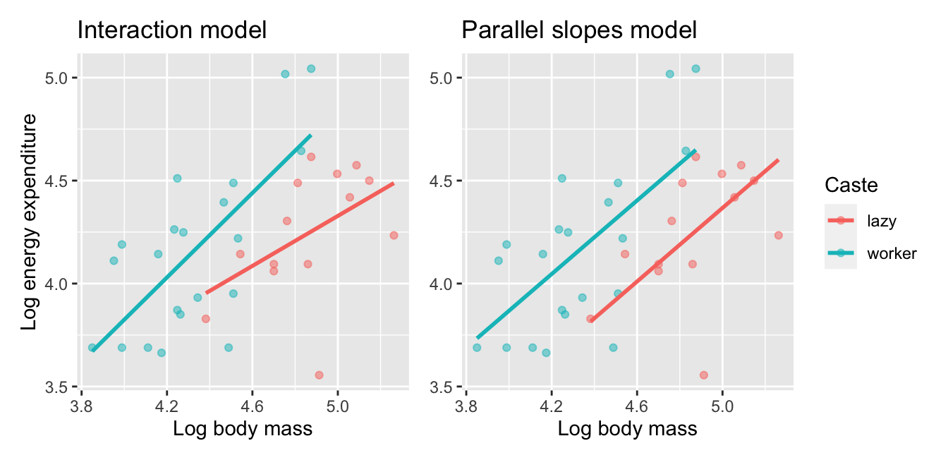
FIGURE 10.9: Comparison of interaction and parallel slopes models for mole rats datasets.
Look closely at the left-hand plot of Figure 10.9 corresponding to an interaction model. While the slopes are indeed different, they do not differ by much and are nearly identical. Now compare the left-hand plot with the right-hand plot corresponding to a parallel slopes model. The two models don’t appear all that different. So in this case, it can be argued that the additional complexity of the interaction model is not warranted. Thus following Occam’s Razor, we should prefer the “simpler” parallel slopes model. Let’s explicitly define what “simpler” means in this case. Let’s compare the regression tables for the interaction and parallel slopes models in Tables 10.14 and 10.15.
model_2_interaction <- lm(ln.energy ~ ln.mass * caste,
                          data = MoleRats)
get_regression_table(model_2_interaction)| term | estimate | std_error | statistic | p_value | lower_ci | upper_ci |
|---|---|---|---|---|---|---|
| intercept | 1.294 | 1.669 | 0.775 | 0.444 | -2.110 | 4.70 |
| ln.mass | 0.607 | 0.343 | 1.771 | 0.086 | -0.092 | 1.31 |
| caste: worker | -1.571 | 1.952 | -0.805 | 0.427 | -5.552 | 2.41 |
| ln.mass:casteworker | 0.419 | 0.415 | 1.009 | 0.321 | -0.427 | 1.26 |
model_2_parallel_slopes <- lm(ln.energy ~ ln.mass + caste,
                              data = MoleRats)
get_regression_table(model_2_parallel_slopes)| term | estimate | std_error | statistic | p_value | lower_ci | upper_ci |
|---|---|---|---|---|---|---|
| intercept | -0.097 | 0.942 | -0.103 | 0.919 | -2.016 | 1.823 |
| ln.mass | 0.893 | 0.193 | 4.625 | 0.000 | 0.500 | 1.286 |
| caste: worker | 0.393 | 0.146 | 2.692 | 0.011 | 0.096 | 0.691 |
Observe how the regression table for the interaction model has 1 more rows (4 versus 3). This reflects the additional “complexity” of the interaction model over the parallel slopes model.
Furthermore, note in Table 10.14 how the offsets for the slope ln.mass::casteworker being 0.419 is comparable to the standard error of \(0.415\). Most importantly, the 95% confidence interval includes zero (0) meaning that it’s quite plausible that the slope of the two regression lines do not differ. These results are suggesting then that irrespective of caste, the relationship between mass and energy expenditure is not significantly different, as indicated by the p-value of \(0.321\).
What you have just performed is a model selection: choosing which model fits data best among a set of candidate models. The model selection we performed first used the “eyeball test”: qualitatively looking at visualizations to choose a model. We then supplemented this evidence quantitatively by examining the remaining columns of the regression table. In the next subsection, we will use another numerical approach via the \(R^2\) (pronounced “R-squared”) value to perform the same model selection.
10.3.2 Model selection using R-squared
At the end of the previous section in Figure 10.9 you compared an interaction model with a parallel slopes model, where both models attempted to explain \(y\) = the average energy expenditure of mole rats. In Tables 10.14 and 10.15, we observed that the interaction model was “more complex” in that the regression table had 4 rows versus the 3 rows of the parallel slopes model.
Most importantly however, when comparing the left and right-hand plots of Figure 10.9, we observed that the two lines corresponding to lazy and worker mole rats were not that different. Furthermore, this was supported by the values in the ln.mass::casteworker row of the regression table for the interaction model, shown in in Table 10.14. Given the similarity of the two slopes, we stated it could be argued that the “simpler” parallel slopes model should be favored.
In this section, we’ll mimic the model selection we just performed, but this time using a numerical and quantitative approach. Specifically, we’ll use the \(R^2\) summary statistic (pronounced “R-squared”), also called the “coefficient of determination”,
Since \(R^2\) is calculated using the variance of the observed and the fitted values of \(y\), let’s first review variance. Recall that one summary statistic of the spread (or variation) of a numerical variable is the standard deviation. The variance is merely the standard deviation squared, and it is therefore the average of the squared deviations of each observation from the mean, as you can see with the formula in A.1.3. In R, the variance can be computed using the var() summary function within summarize().
Recall that to get: 1) the observed values \(y\), 2) the fitted values \(\widehat{y}\) from a regression model, and 3) the resulting residuals \(y - \widehat{y}\) (i.e., deviations from the mean), we can apply the get_regression_points() function with our saved model, in this case model_2_interaction:
# A tibble: 35 × 6
      ID ln.energy ln.mass caste  ln.energy_hat residual
   <int>     <dbl>   <dbl> <fct>          <dbl>    <dbl>
 1     1     3.689   3.85  worker         3.671    0.018
 2     2     3.689   3.989 worker         3.813   -0.125
 3     3     3.689   4.111 worker         3.938   -0.25
 4     4     3.664   4.174 worker         4.004   -0.34
 5     5     3.871   4.248 worker         4.08    -0.208
 6     6     3.85    4.263 worker         4.094   -0.244
 7     7     3.932   4.344 worker         4.177   -0.245
 8     8     3.689   4.489 worker         4.326   -0.637
 9     9     3.951   4.511 worker         4.349   -0.397
10    10     4.111   3.951 worker         3.775    0.336
# ℹ 25 more rows
Let’s now use the var() summary function within summarize() to compute the variance of these three terms:
get_regression_points(model_2_interaction) %>%
  summarize(var_y = var(ln.energy),
                      var_y_hat = var(ln.energy_hat),
                      var_residual = var(residual))
# A tibble: 1 × 3
var_y var_y_hat var_residual
<dbl> <dbl> <dbl>
1 0.140050 0.0599682 0.0801086Observe that the variance of \(y\) is equal to the variance of \(\widehat{y}\) plus the variance of the residuals. But what do these three terms tell us individually?
First, the variance of \(y\) (denoted as \(var(y)\)) tells us how much do mole rats differ in energy expenditure. The goal of regression modeling is to fit a model that hopefully explains this variation. In other words, we want to understand what factors explain why certain mole rats have high energy expenditures, while others have low expenditures. The variance of \(y\) is independent of the model; this is just data. In other words, whether we fit an interaction or parallel slopes model, \(var(y)\) remains the same.
Second, the variance of \(\widehat{y}\) (denoted as \(var(\widehat{y})\)) tells us how much the fitted values from our interaction model vary. That is to say, after accounting for (1) the log mass and (2) caste of a mole rat in an interaction model, how much do our model’s explanations of log energy expenditure vary?
Third, the variance of the residuals tells us how much do “the left-overs” from the model vary. Observe how the points in the left-hand plot of Figure 10.9 scatter around the two lines. Say instead all the points fell exactly on their corresponding line. Then all residuals would be zero and hence the variance of the residuals would be zero.
We’re now ready to introduce \(R^2\):
\[ R^2 = \frac{var(\widehat{y})}{var(y)} \]
It is the proportion of the spread/variation of the outcome variable \(y\) that is explained by our model, where our model’s explanatory power is embedded in the fitted values \(\widehat{y}\). Furthermore, since it can be mathematically proven that \(0 \leq var(\widehat{y}) \leq var(y)\) (a fact we leave for an advanced class on regression), we are guaranteed that:
\[ 0 \leq R^2 \leq 1 \]
\(R^2\) can be interpreted as follows:
- \(R^2\) values of 0 tell us that our model explains 0% of the variation in \(y\). Say we fit a model to the mole rats data and obtained \(R^2 = 0\). This would be telling us that the combination of explanatory variables \(x\) we used and model form we chose (interaction or parallel slopes) tell us nothing about energy expenditure of a mole rat. The model is a poor fit.
- \(R^2\) values of 1 tell us that our model explains 100% of the variation in \(y\). Say we fit a model to the mole rats data and obtained \(R^2 = 1\). This would be telling us that the combination of explanatory variables \(x\) we used and model form we chose (interaction or parallel slopes) tell us everything we need to know about energy expenditure of a mole rat.
In practice however, \(R^2\) values of 1 almost never occur. Think about it in the context of mole rats. There are an infinite number of factors that influence why certain mole rats expend much energy while others don’t. The idea that a human-designed statistical model can capture all the heterogeneity of all mole rats is bordering on hubris. However, even if such models are not perfect, they may still prove useful in predicting energy expenditure. A general principle of modeling we should keep in mind is a famous quote by eminent statistician George Box: “All models are wrong, but some are useful.”
Let’s repeat the above calculations for the parallel slopes model and compare them in Table 10.16.
| model | var_y | var_y_hat | var_residual | r_squared |
|---|---|---|---|---|
| Interaction | 0.14 | 0.060 | 0.080 | 0.428 |
| Parallel slopes | 0.14 | 0.057 | 0.083 | 0.409 |
Observe how the \(R^2\) values are near identical at around 0.409 = 40.9%. In other words, the additional complexity of the interaction model barely improves our \(R^2\) value by a minimal amount. Thus, we are inclined to favor the “simpler” parallel slopes model.
Now let’s repeat this \(R^2\) comparison between interaction and parallel slopes model for our models of \(y\) = coverage area of red algae which you visually compared in Figure 10.7. We compare these values in Table 10.17
| model | var_y | var_y_hat | var_residual | r_squared |
|---|---|---|---|---|
| Interaction | 293 | 67.0 | 227 | 0.228 |
| Parallel slopes | 293 | 25.4 | 268 | 0.087 |
Observe how the \(R^2\) values are now very different! In other words, since the additional complexity of the interaction model over the parallel slopes model improves our \(R^2\) value by a relatively large amount (0.228 versus 0.087, it could be argued that the additional complexity is warranted.
As a final note, we can also use the third of our get_regression() wrapper functions, get_regression_summaries(), to quickly automate calculating \(R^2\) for both the interaction and parallels slopes models, first for the MoleRats data.
# A tibble: 1 × 9
  r_squared adj_r_squared       mse     rmse sigma statistic p_value    df  nobs
      <dbl>         <dbl>     <dbl>    <dbl> <dbl>     <dbl>   <dbl> <dbl> <dbl>
1     0.428         0.372 0.0778555 0.279026 0.296     7.727   0.001     3    35
# A tibble: 1 × 9
r_squared adj_r_squared mse rmse sigma statistic p_value df nobs
<dbl> <dbl> <dbl> <dbl> <dbl> <dbl> <dbl> <dbl> <dbl>
1 0.409 0.372 0.0804143 0.283574 0.297 11.075 0 2 35In addition to the \(R^2\) value for a model, this wrapper function also returns an adjusted-\(R^2\) value, which accounts for the additional feature contained in the interaction model. While \(R^2\) will always increase as we add additional variables to our model, the adjusted-\(R^2\) will only increase if the more complex model is better. You’ll notice that the adjusted-\(R^2\) of the interaction and the parallel slopes models for the MoleRats data is identical at 0.372. This indicates that the additional complexity of the model that accounts for an interaction between the two explanatory variables is not any better than the simpler parallel-slopes model.
In contrast when we compare the interaction and parallel slopes models for the IntertidalAlgae data, we see a marked increase in the adjusted-\(R^2\) values with the interaction model:
# A tibble: 1 × 9
  r_squared adj_r_squared     mse    rmse  sigma statistic p_value    df  nobs
      <dbl>         <dbl>   <dbl>   <dbl>  <dbl>     <dbl>   <dbl> <dbl> <dbl>
1     0.228          0.19 222.977 14.9324 15.422     5.912   0.001     3    64
# A tibble: 1 × 9
r_squared adj_r_squared mse rmse sigma statistic p_value df nobs
<dbl> <dbl> <dbl> <dbl> <dbl> <dbl> <dbl> <dbl> <dbl>
1 0.087 0.057 263.867 16.2440 16.639 2.892 0.063 2 6410.4 Conclusion
Chapter Learning Summary
-
Multiple linear regression examines the relationship between a
numerical response variable and multiple explanatory variables, which
may be numerical and/or categorical.
-
There is an interaction effect when the effect of an explanatory
variable on the response variable depends on a second explanatory
variable.
-
Because simpler models are to be preferred (Occam’s razor), a
parallel slopes (or non-#interaction) model is more appropriate if there
is no evidence for an interaction effect.
-
Data visualization, R-squared values and p-values can provide
evidence for an interaction effect.
10.4.1 What’s to come?
You’ve now concluded the last major part of the book on “Data Modeling with moderndive.” The closing Chapter 11 concludes this book with a review and short case studies involving real data. You’ll see how the principles in this book can help you become a great storyteller with data!