
Chapter 11 Tell Your Story with Data
Recall in the Preface and at the end of chapters throughout this book, we displayed the “ModernDive flowchart” mapping your journey through this book.
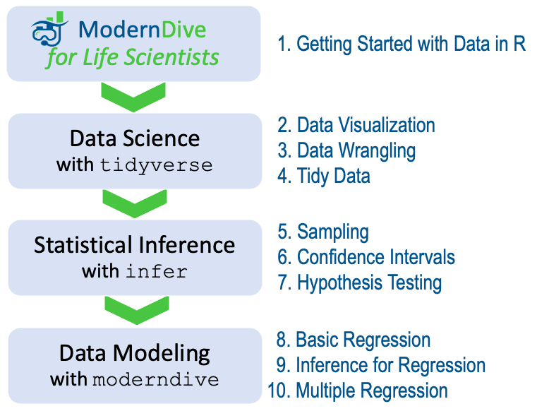
FIGURE 11.1: ModernDive for Life Scientists flowchart.
11.1 Review
Let’s go over a refresher of what you’ve covered so far. You first got started with data in Chapter 1 where you learned about the difference between R and RStudio, started coding in R, installed and loaded your first R packages, and explored your first dataset. Then you covered the following three parts of this book:
- Data science with
tidyverse. You assembled your data science toolbox usingtidyversepackages. In particular, you:- Ch.2: Visualized data using the
ggplot2package. - Ch.3: Wrangled data using the
dplyrpackage. - Ch.4: Learned about the concept of “tidy” data as a standardized data input and output format for all packages in the
tidyverse. Furthermore, you learned how to import spreadsheet files into R using thereadrpackage.
- Ch.2: Visualized data using the
- Statistical inference with
infer. Using your newly acquired data science tools and helper functions from themoderndivepackage, you unpacked statistical inference using theinferpackage. In particular, you: - Data modeling with
moderndive. Once again using these data science tools and helper functions from theinferandmoderndivepackages, you fit your first data models. In particular, you:
Throughout this book, we’ve guided you through your first experiences of “thinking with data,” an expression originally coined by Dr. Diane Lambert. The philosophy underlying this expression guided your path in the flowchart in Figure 11.1.
This philosophy is also well-summarized in “Practical Data Science for Stats”: a collection of pre-prints focusing on the practical side of data science workflows and statistical analysis curated by Dr. Jennifer Bryan and Dr. Hadley Wickham. They quote:
There are many aspects of day-to-day analytical work that are almost absent from the conventional statistics literature and curriculum. And yet these activities account for a considerable share of the time and effort of data analysts and applied statisticians. The goal of this collection is to increase the visibility and adoption of modern data analytical workflows. We aim to facilitate the transfer of tools and frameworks between industry and academia, between software engineering and statistics and computer science, and across different domains.
In other words, to be equipped to “think with data” in the 21st century, analysts need practice going through the “data/science pipeline” we saw in the Preface (re-displayed in Figure 11.2). It is our opinion that, for too long, statistics education has only focused on parts of this pipeline, instead of going through it in its entirety.
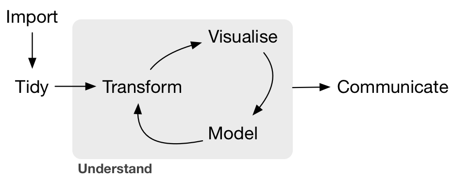
FIGURE 11.2: Data/science pipeline.
11.2 Case study: Effective data storytelling
As we’ve progressed throughout this book, you’ve seen how to work with data in a variety of ways. You’ve learned effective strategies for plotting data by understanding which types of plots work best for which combinations of variable types. You’ve summarized data in spreadsheet form and calculated summary statistics for a variety of different variables. Furthermore, you’ve seen the value of statistical inference as a process to come to conclusions about a population by using sampling. Lastly, you’ve explored how to fit linear regression models and the importance of checking the conditions required so that all confidence intervals and hypothesis tests have valid interpretation. All throughout, you’ve learned many computational techniques and focused on writing R code that’s reproducible.
We now present another case study, but this time on the “effective data storytelling” done by data journalists around the world. Great data stories don’t mislead the reader, but rather engulf them in understanding the importance that data plays in our lives through storytelling.
11.2.1 US Births in 1999
The US_births_1994_2003 data frame included in the fivethirtyeight package provides information about the number of daily births in the United States between 1994 and 2003. For more information on this data frame including a link to the original article on FiveThirtyEight.com, check out the help file by running ?US_births_1994_2003 in the console.
It’s always a good idea to preview your data, either by using RStudio’s spreadsheet View() function or using glimpse() from the dplyr package:
Rows: 3,652
Columns: 6
$ year          <int> 1994, 1994, 1994, 1994, 1994, 1994, 1994, 1994, 1994, 19…
$ month         <int> 1, 1, 1, 1, 1, 1, 1, 1, 1, 1, 1, 1, 1, 1, 1, 1, 1, 1, 1,…
$ date_of_month <int> 1, 2, 3, 4, 5, 6, 7, 8, 9, 10, 11, 12, 13, 14, 15, 16, 1…
$ date          <date> 1994-01-01, 1994-01-02, 1994-01-03, 1994-01-04, 1994-01…
$ day_of_week   <ord> Sat, Sun, Mon, Tues, Wed, Thurs, Fri, Sat, Sun, Mon, Tue…
$ births        <int> 8096, 7772, 10142, 11248, 11053, 11406, 11251, 8653, 791…
We’ll focus on the number of births for each date, but only for births that occurred in 1999. Recall from Section 3.2 we can do this using the filter() function from the dplyr package:
As discussed in Section 2.4, since date is a notion of time and thus has sequential ordering to it, a linegraph would be a more appropriate visualization to use than a scatterplot. In other words, we should use a geom_line() instead of geom_point(). Recall that such plots are called time series plots.
ggplot(US_births_1999, aes(x = date, y = births)) +
  geom_line() +
  labs(x = "Date",
       y = "Number of births",
       title = "US Births in 1999")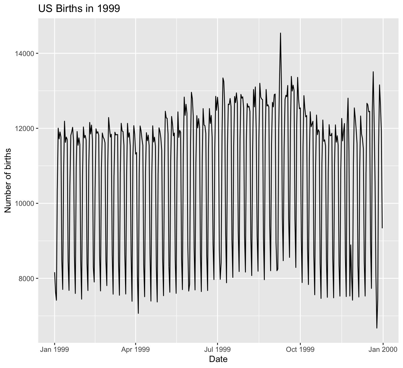
FIGURE 11.3: Number of births in the US in 1999.
We see a big dip occurring just before January 1st, 2000, most likely due to the holiday season. However, what about the large spike of over 14,000 births occurring just before October 1st, 1999? What could be the reason for this anomalously high spike?
Let’s sort the rows of US_births_1999 in descending order of the number of births. Recall from Section 3.8 that we can use the arrange() function from the dplyr function to do this, making sure to sort births in descending order:
# A tibble: 365 × 6
    year month date_of_month date       day_of_week births
   <int> <int>         <int> <date>     <ord>        <int>
 1  1999     9             9 1999-09-09 Thurs        14540
 2  1999    12            21 1999-12-21 Tues         13508
 3  1999     9             8 1999-09-08 Wed          13437
 4  1999     9            21 1999-09-21 Tues         13384
 5  1999     9            28 1999-09-28 Tues         13358
 6  1999     7             7 1999-07-07 Wed          13343
 7  1999     7             8 1999-07-08 Thurs        13245
 8  1999     8            17 1999-08-17 Tues         13201
 9  1999     9            10 1999-09-10 Fri          13181
10  1999    12            28 1999-12-28 Tues         13158
# ℹ 355 more rows
The date with the highest number of births (14,540) is in fact 1999-09-09. If we write down this date in month/day/year format (a standard format in the US), the date with the highest number of births is 9/9/99! All nines! Could it be that parents deliberately induced labor at a higher rate on this date? Maybe? Whatever the cause may be, this fact makes a fun story!
Learning check
(LC11.2) What date between 1994 and 2003 has the fewest number of births in the US? What story could you tell about why this is the case?
Time to think with data and further tell your story with data! How could statistical modeling help you here? What types of statistical inference would be helpful? What else can you find and where can you take this analysis? What assumptions did you make in this analysis? We leave these questions to you as the reader to explore and examine.
Remember to get in touch with us via our contact info in the Preface. We’d love to see what you come up with!
Concluding remarks
Now that you’ve made it to this point in the book, we suspect that you know a thing or two about how to work with data in R! You’ve also gained a lot of knowledge about how to use simulation-based techniques for statistical inference and how these techniques help build intuition about traditional theory-based inferential methods like the \(t\)-test.
The hope is that you’ve come to appreciate the power of data in all respects, such as data wrangling, tidying datasets, data visualization, data modeling, and statistical inference. In our opinion, while each of these is important, data visualization may be the most important tool for a citizen or professional data scientist to have in their toolbox. If you can create truly beautiful graphics that display information in ways that the reader can clearly understand, you have great power to tell your tale with data. Let’s hope that these skills help you tell great stories with data into the future. Thanks for coming along this journey as we dove into modern data analysis using R and the tidyverse!